Secure and usable: making the “front door” work for everyone
When it comes to accessibility, too often, teams polish the “transaction” but forget the front door.
Most of our content centre on people with lived experience using assistive tech and the diverse ways they navigate the web. This blog zooms in on a universal component, authentication.
Before we dive in, it’s fair to say passkeys are generally more secure and, in most cases, more user-friendly than passwords. But they are not perfect either. Passkeys come with their own inclusivity issues. They often assume access to a modern mobile device, which not everyone has, and block legit use cases when someone acts on another person’s behalf. One-time passwords are not going away any time soon. Accessibility cannot be treated as a future state of perfection. Even small tweaks to today’s reality, like putting a one-time password on its own line, can make a world of difference.
When it comes to digital experiences, cyber can’t live in a vacuum. There’s little point in building Fort Knox-level authentication if only 5% of users can navigate the drawbridge. Every time security friction locks people out, you’re not just protecting the castle, you’re creating reputation damage, diverting customers to expensive support channels, drowning engineers in support tickets, and handing competitors your market share on a silver platter. Cyber risk isn’t separate from the business. It must be delicately balanced against many other dimensions of risk including customer sentiment, brand, and revenue risk.
There’s a long-running tension between security and usability, and it’s usually the people at the ‘edges’ who feel it most. Ironically, they’re also the very users most at risk of exploitation, yet consideration of their online safety is too often parked in a backlog. Organisations sprint to ship shiny features, optimise for the mythical ‘average’ user, and leave those who don’t fit the box to wrestle with clunky manual workarounds, call centre service delivery or worse, lock them out of the market altogether.
Security and usability can absolutely go hand-in-glove. What looks like a tiny interaction (a password box, the ‘eye’ icon reveal toggle, or a six-digit code) can either be a smooth, secure welcome… or a hard stop that locks people out of essential services.
Below, we unpack three small choices fundamental to the common authentication experience that have an outsized impact:
- real-time password validation
- password reveal
- second-factor code delivery and formatting
1) Real-time password validation (done right)
__Why teams add it__
Many authentication platforms have good intentions when it comes to accessibility, adding real-time password checks and accessibility enhancements to their sign-in widgets. But when those features aren’t co-designed with end users, good intentions can backfire. And at the scale these platforms operate, one small misstep in a single login box can lock millions of people out of essential services worldwide.
Good intentions to reduce errors, make rules obvious, and support assistive tech can go very very wrong. For example authentication widgets that announce every keystroke via aria-live as the user types. The linked video painfully illustrates how good intentions can go very wrong. It shows screen-reader users, this becomes a wall of speech: distract-ing, fatiguing, and sometimes so noisy that people abandon the task or re-enter passwords repeatedly.
Instead, anchor your approach in WCAG’s guidance on status messages and error identification by announcing important changes without stealing focus (SC 4.1.3 Status Messages). Use live regions sparingly and match urgency to the message (e.g., role="status" = polite for most updates; reserve role="alert"/assertive for critical errors only).
In practical terms this pattern would result in showing a visual checklist of rules (length, common-password blocklist, etc.) as a sighted user types their password, but doesn’t announce every keystroke via screen reader.
On blur however (or submit) the widget announces:
- unmet rules in a single, concise status message (role="status"), linked to the field with aria-describedby.
- Only escalate to role="alert" for blocking errors.
- Keep focus in the field; don’t yo-yo users around the DOM.
- Ensure messages are visible, high-contrast, and persist long enough to be read.
- This respects assistive technologies and aligns with accessible live-region practice.
2) Second-factor codes (make them fast and findable)
Yes, passkeys and phishing-resistant MFA are the direction of travel. But SMS/email/app one-time codes will persist in many real-world contexts for some time. Treat them as a UX surface with security consequences.
Buried codes in dense paragraphs that share the same typography as body text create hurdles for screen readers to yank out just the digits, and low-vision users will often take longer to find what they’re looking for. When a one time code shares a line with other text, copying grabs stray spaces/words resulting in some users retrying many times.
People who rely on screen readers, magnification, lack digital confidence or have a sensitivity to glare simply need more time to navigate their email app to find a one time password. WCAG 2.2.1 Timing Adjustable suggests giving users the ability to turn off, adjust, or extend time limits. In a nutshell, ridiculously short timeouts penalise people using assistive tech, a suitable time limit may be good enough. If you’re not sure on a ‘suitable’ timelimit test with a handful of users who rely on colour inversion and screen readers - you’ll quickly gague what works and what’s unreasonable.
A deliberately simple practical pattern for one time passwords comprises
- Putting the code on its own line, two font sizes larger, and bold.
- Using a fixed-width font for the digits (easier to perceive at high zoom).
- Prepend a short, consistent label (“Your code:”) and then just the digits on the next line.
- Add a “Copy code” button with clear focus states and an aria-live polite confirmation (“Code copied”).
- For web inputs, set autocomplete="one-time-code" so iOS and other platforms can auto-fill and consider domain-bound codes to reduce phishing risk.
- provide an extend/resend flow and signal remaining time in order to avoid punishing assistive-tech users.
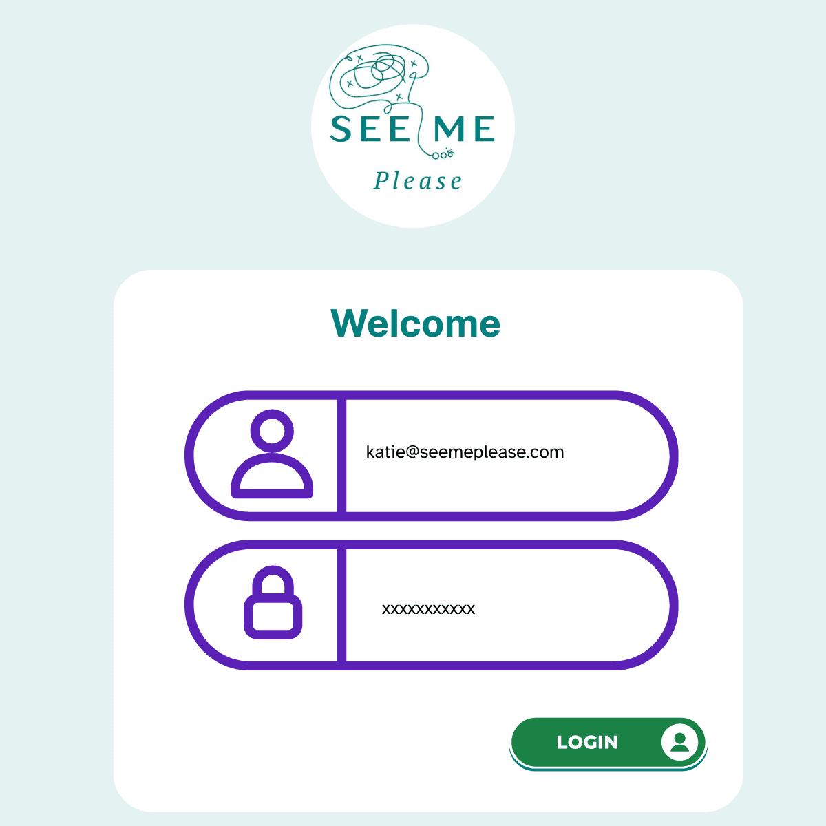
3) Password reveal (small toggle, big win)
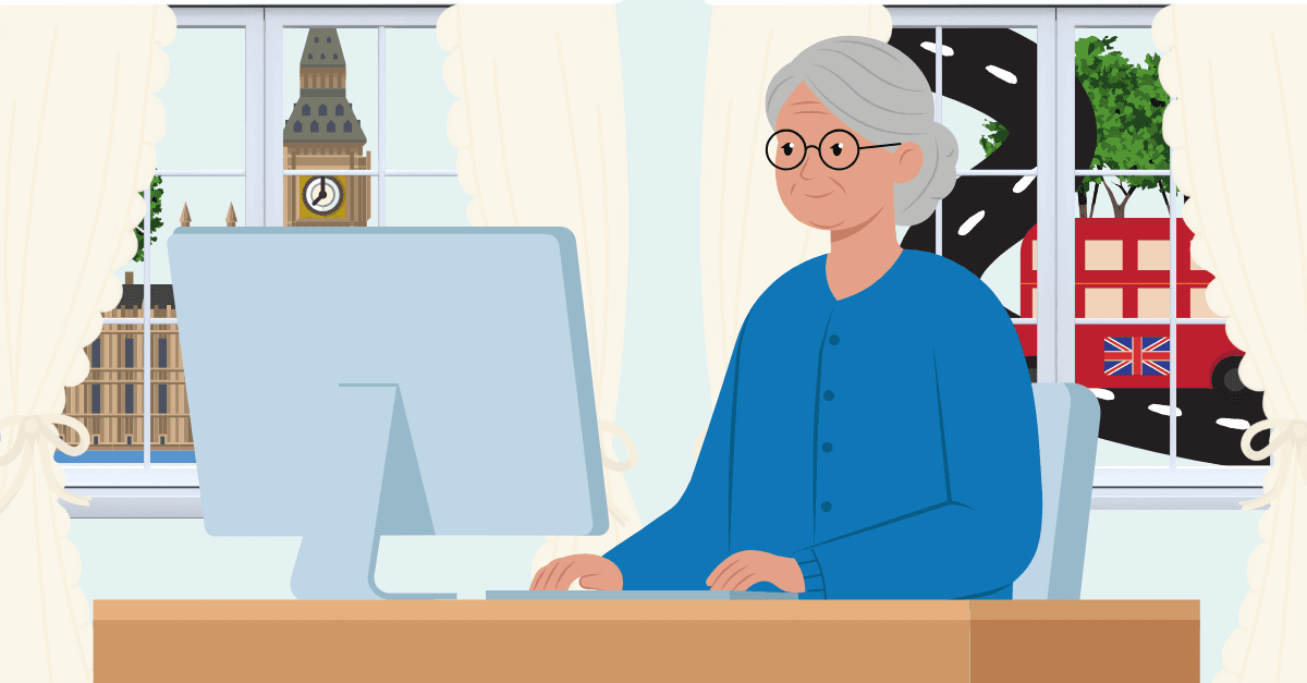
We recently undertook some research and were struck by how a tiny missing feature was creating huge friction, particularly for older users. These older users are digital-native banking customers yet when they typed their passwords, every single one focused intently on the keyboard, not the screen. Password entry was smooth only when a simple feature was present: the little “eye” icon to reveal the password. They’d tap it, double-check the text after typing, and move on confidently.
When it’s missing, though, the experience changes completely. Masked passwords shift the cognitive and motor load onto the user, forcing them to memorise complex strings, type flawlessly, and troubleshoot errors without any visual confirmation. A simple Show/Hide toggle drastically reduces errors and helps far more people than you might think:
- Older users
- People with low vision or magnification
- Users with motor impairments or dyslexia
- ESL users
- Anyone juggling a tiny touchscreen
- Younger users learning to type
In an earlier post, we highlighted how small affordances like password reveal toggles reduce retries and avoid the trap of “security by typo.” It’s a universal usability hack — one simple icon that makes life better for everyone.
The WCAG gurus dont require a show/hide toggle, but explicitly call out that hiding characters increases cognitive load and that optionally showing the password can improve success, especially when people struggle with memory, transcription, or precise typing. Success Criterion 3.3.8 Accessible Authentication, stipulates authentication should not rely on memory alone. That means: allow paste, support password managers, and avoid puzzles that force recall. Reveal supports the same goal: lower cognitive burden while preserving security.
If you don’t offer reveal, people create workarounds that compromise the security posture like reusing weak strings. Even the UK’s NCSC acknowledges that complexity-heavy policies drive these behaviours and recommends shifting to technical controls + password-manager-friendly UX over memory games.
Practical pattern
- Default mask; provide a clearly labelled toggle (aria-pressed stateful button).
- Preserve type=password so browsers/password managers still work; toggling should update type to text and back.
- Allow paste (don’t block it). Honour autocorrect/autocomplete="current-password" for login and new-password for registration.
- Keep the toggle keyboard accessible and announced by screen readers.
So, a reveal toggle isn’t a normative requirement but removing the memory/transcription burden is. A reveal control is a pragmatic way to reduce errors and, together with paste/autofill, helps you meet criterion 3.3.8. And is appreciated by some users more than you may think!
[Accessible Authentication WCAG AA 3.3.8](https://www.w3.org/WAI/WCAG22/Understanding/accessible-authentication-minimum.html "Accessible Authentication WCAG AA 3.3.8")
Implementation checklist (copy/paste for your backlog)
- Policy & server truth- Enforce password policy server-side; expose the rules visually and semantically, but when it comes to screen-reader behaviour, use polite live regions for guidance; reserve assertive for critical, blocking errors only;
- Don’t announce every keypress;
- Reveal toggle- Add a Show/Hide control with proper name/role/state;
- Allow password paste;
- Second-factor code templates - use a standalone line, larger size, bold, monospaced, copy button with polite confirmation; support autocomplete="one-time-code"
- Provide extend/resend options to design for longer reading/interaction time.
Why this matters (beyond tick-boxes)
In authentication, some loss of UX is often necessary for security. But poor UX should never discriminate. If the experience is difficult, it must be equally difficult for everyone — and only to the extent required to achieve the right level of security
Security improves when people can succeed on the first try. Accessible, comprehensible flows lower abandonment and the temptation to store credentials unsafely or reuse weak ones
Equity improves because you aren’t asking edge users to “go faster, read smaller, remember more, and hear everything at once.”
Cost reduces, there are fewer password resets, fewer lockouts and fewer support calls.
Make the front door seamless and you make the whole house safer. Designing security features with the full diversity of our community in mind, from people using screen readers and magnifiers to those relying on voice control and other adaptations, doesn’t just protect those most at risk. It creates a seamless, intuitive experience for everyone.