When Digital Services Just Work, You Barely Notice
Let’s be honest—almost everyone has a horror story about a clunky government website, a painful job application process, or those maddening traffic light reCAPTCHA puzzles. But when was the last time you raved about a seamless digital experience? Chances are, you didn’t. Because when a digital service just works—intuitively, quickly, without friction—it fades into the background. And maybe that should be the measure of digital design success.
Most online experiences fall into the "life admin" category—stuff that just needs to get done. Fast. No one juggling dinner, chasing kids to do their homework, trying to grab the daily news while paying a bill online is marvelling at the UX.
The best thing a digital service can do? Get out of the way. The less users notice, the better the experience probably is. That said, the value of a designer nailing their craft shouldn’t be underestimated. While you may not get standing ovations for slick UIs or seamless flows—maybe that’s the ultimate compliment. Invisible design is highly valuable.
I could go on (and on) about bad online services. But honestly, it’s harder to name the ones that stand out for the right reasons. Except one: Amazon Marketplace’s checkout. I’m a repeat offender—boxes appear at my coworking space way too often. But every time I order, I double-check that I actually did. It’s that fast.
Two crystal-clear clicks:
“Proceed to checkout” → “Place your order.”
Done in five seconds.
Setting aside the anti-consumption debate—that flow is brilliant. It’s fast, frictionless, and so intuitive you barely notice it. That’s the magic. Especially compared to sites still making you manually type out your full credit card number. In 2025. Come on. I do not want the handbag that bad.
Focus On Universal Usability, not Accessibility
After seven years inside the machinery of government trying to digitise clunky services, I threw the stability of the public service to the wind to found a company focused on online usability that truly reflects our diverse communities. This journey turned me into a bit of a service-design nerd. So I started researching the design practice of Amazon Marketplace and discovered they have experience designers specifically dedicated to making the platform inclusive for older users. I’ve never seen that function anywhere else.
My days are now spent researching the diverse ways people navigate the online world. And let me tell you—what counts as “usable” varies wildly from what is deemed ‘accessible’ or ‘WCAG conforming’. Universal usability is a complex, human-centred discipline with different definitions of friction, clarity, and ease of use depending on who the person is on the other end of the screen.
When designers hear “digital inclusion,” the default is often to think “accessibility”. The opaque term of ‘inaccessible’ is incredibly unhelpful lacking actionable and specific insights that techologists need to solve the problem – but that is for another article.
Usually, ‘accessibility’ means handing off to a specialist consultant or a central accessibility team, because, let’s be real: the global accessibility standards are dense, hyper-technical, and a slog to interpret (ironically ‘inaccesible’)—especially if you’re just trying to build something usable.
I have absolutely no doubt, most designers, engineers, and product folks genuinely want to do the right thing. No one’s out here intentionally excluding people with disabilities from booking a flight or transferring money. But digital accessibility is a complex, nuanced space—even for the best cross-functional teams. And with limited internal expertise, most teams end up outsourcing it, which slows things down, costs a bomb, and rarely builds internal capability. The knowledge often sits with third parties, not the people actually designing and building the product.
Well-meaning teams often default to screen reader testing and think, “Great—we’ve covered accessibility.” But the needs of blind users are just one slice of the puzzle. There’s no one-size-fits-all. Accessibility—and better yet, usability—requires understanding a huge range of diverse user preferences and needs: people with low vision who use zoom and colour inversion, Deaf users who rely on captions and visual structure, neurodivergent users who crave calm and clarity, people with limited English who depend on intuitive visuals, and users with physical disabilities using switch control, eye tracking, or voice commands.
Why Older Users Hold the Key to Designing Good Digital Services
And then there’s older users—often overlooked, yet making up a huge chunk of the online population. What we’ve found in our user research over many user testing projects is that older users are incredibly capable but often lack confidence. They’re impatient, they click wildly to just get the thing done, and they don’t want to feel like they’re failing (okay so I’m generalising, but there’s certainly a trend). The stereotype that older people “prefer to talk to someone in person” is outdated. What they really want is independence and convenience. They just need design that feels intuitive, forgiving, and fast. If it doesn’t feel that way, it’s often written off as “broken” before the second screen loads.
The Australian Digital Inclusion Index (ADII) tells us what we see firsthand: older Australians still score significantly lower on “Digital Ability” than other age groups—even as access and affordability improve. It’s not just about owning a device. It’s about navigating apps, tweaking settings, and feeling confident that you’re not going to break something.
That gap in confidence shows up in See Me Please’s user research too. We consistently see fewer older participants opting into app-based testing than browser-based sessions. Many lean towards the comfort of a big screen, physical keyboard, and the familiar hum of a desktop. Of course, not all older users are the same, but the trend is real.
This isn’t about “tech literacy” in the way we usually frame it. My 75-year-old mother-in-law practically lives on Facebook—dropping a cheerful “lovely” on evert check-in from the ladies at golf and grandkid photo. And she didn’t take a course to get there. Like the rest of us, she learned through intuition, repetition, and a bit of curiosity. Same tech, same platform—but different confidence levels depending on the context.
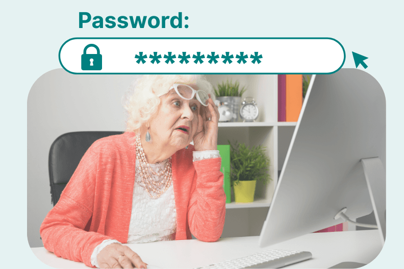
A perfect case in point? Passwords.
One of the most common friction points we see in testing? The humble password field.
Many older users aren’t confident typists—they often look down at the keyboard as they type. So when something goes wrong, they’re not sure what went wrong. And while we won’t get into the (nonexistent) world of password managers for this demographic, the reality is that most older users don’t have any tools to help them out. That means the design of the password field itself becomes make-or-break.
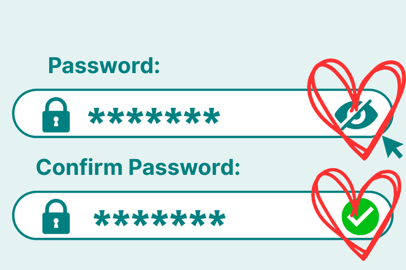
And yet, a feature that could make a world of difference often gets overlooked—possibly not even seen as a “real” feature: the “reveal password” icon, paired with a simple green tick confirming when the password is strong or matches.
These aren’t just nice-to-have accessibility additions—they’re confidence features.
We’ve observed many older users spending close to 20 minutes trying to set a password. Six failed attempts. Multiple error messages. Rising frustration. Some clearly explain they’re looking for that little eye icon to double-check what they’ve typed. And when it’s not there, you can feel the tension rise. In a few cases, without that one small password reassurance mechanism, the entire experience has been derailed. It didn’t matter how well the rest of the UI was designed - trust was lost and user was annoyed.
Designers might overlook that little eye icon as a minor detail – or not consider it at all—but for someone who isn’t a confident typer, it can be the difference between a smooth login and a full-blown rage-quit. And for those who look at the traffic and abandonment analytics, you might chalk up the drop-off to “forgotten password.” But that’s not it. In this case what’s really missing is a tiny icon that says “here’s what you typed’ with a confidence boosting validation tick of approval.
Brutally Honest But Golden Feedback
Research backs this up. A 2022 study from the University of Melbourne (Hill et al.) showed that older adults’ confidence with apps hinges on predictability, clear feedback, and interface clarity. When that’s missing, even the most capable users are more likely to give up—fast.
And yet, older users want to engage. A 2021 Telstra report found that 57% of older Australians want to use more digital technology. They’re not unwilling—they’re just tired of wrestling bad design.
One last thing? Older users don’t mess around. Many have lost interest in a verbal filter—and honestly, it’s a superpower. You’ll never get sugar-coated, people pleasing feedback from a 78-year-old trying to book a medical appointment online. You’ll get the truth. Blunt, hilarious, occasionally brutal—but golden for design teams. They are, without a doubt, some of the best customers to provide user feedback.
So what can we learn from Amazon’s checkout brilliance? It’s not just about speed—it’s about confidence, clarity, and reducing cognitive load for every type of user. Older customers might not gush about UX in a Slack channel, but they’ll tell you—straight up—when something’s not working – something Amazon might recognise. And if it does work? You won’t hear a thing. Which might just be the ultimate compliment when it comes to digital design.