Insurance
Using Colour to Compare Plan Choices
How insurance comparison tables that rely on colour alone to flag the best option fail users with low vision or colour blindness, and what an accessible alternative looks like.
Video walkthrough: accessible use of colour in insurance comparison tables
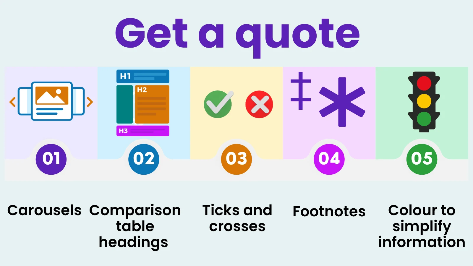
5 things insurers’ quote flows get wrong

Accessible Date Pickers

Dark Mode Overview

How to Implement Accessible Tables

Inclusive Social Media
Labelling Buttons

Magnification Overview
Making Images Accessible

MFA codes in email

Page Structure and Headings

Real-Time Password Validation

Screen Reader Overview
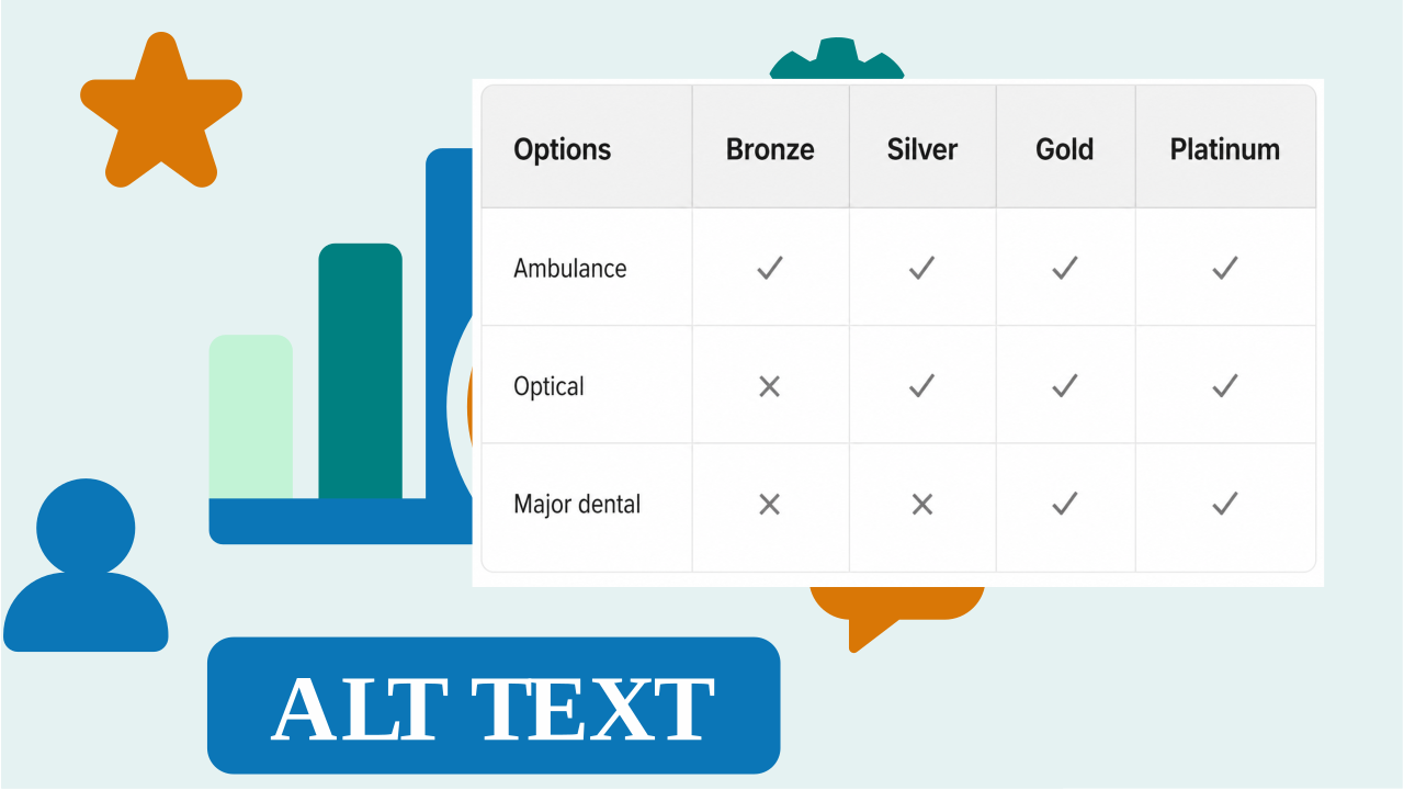
Ticks and Crosses in Comparison Tables