Blog
Field notes and commentary from real testing sessions with blind, Deaf, neurodivergent, older, and ESL users.
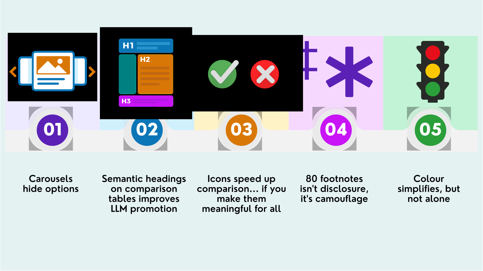
Insurance Comparison Tables Are Quietly Costing You Customers
A usability review of how insurers present cover, and why the fix is simpler than a redesign.
Insurance Footnotes Are Failing Customers: An Accessibility and Usability Review of Global Insurance Companies
The See Me Please Insurance Footnote Audit 2026 reviewed 62 targeted insurance pages across Australia, the United Kingdom, Ireland, the United States and the European Union, successfully measuring 53. The audit was prompted by recurring behaviour observed in user testing: customers across disability, age and language cohorts repeatedly struggled with footnotes while trying to understand price, cover, exclusions and conditions. We found pages using up to 96 markers, multiple symbol systems and qualifications separated from the claims they changed. The result is a disclosure pattern that can technically record information without reliably communicating it, creating universal-usability friction across insurance journeys.
How to Prioritise an Accessibility Backlog: What 5,823 Test Findings Reveal About Severity, Frequency, and Effort
Published by See Me Please | Data source: 15 independent usability studies, 5,823 approved synthesised findings, 2026
Beyond Compliance: What 1,468 Positive Usability Findings Reveal About Design Patterns That Work
Published by See Me Please | Data source: 15 independent usability studies, 1,468 positive-category findings, 2026

Hard of Hearing, Harder to Please
There's a common assumption that being hard of hearing means checking out of music. It doesn't, and SMP Engagement Lead Dan is living proof. Here's what actually chasing good sound looks like when you can't hear all of it.
Accessible ≠ Usable: Testing a Popular Design Maxim Against 1,580 Real Scores, and a Warning About How We Measure It
A research note from See Me Please | Data source: 1,580 tester-task scoring events across 13 usability studies, 2026
The Volatility Problem: Why an Average Accessibility Score Is Often the Least Trustworthy Number in the Report
A research note from See Me Please | Data source: 526 task-by-cohort score groups, 15 usability studies, 2026
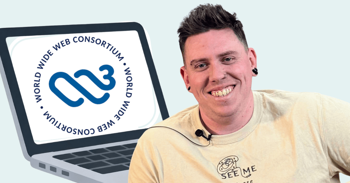
See Me Please Is Now a W3C Member
We used to help organisations meet the standard. Now we help write it.
Moderated vs Unmoderated User Research: Which One Actually Gets You the Truth?
Here's what the research actually shows, and how we decide which method to use, tester by tester.
EU and UK Digital Accessibility Laws: Status, Enforcement, and the Reality Gap
Legislative Evolution, Non-Conformance, Sector Friction and Human Impact
Digital Accessibility Trends in Ireland
Two contrasting stories in Ireland's accessibility landscape
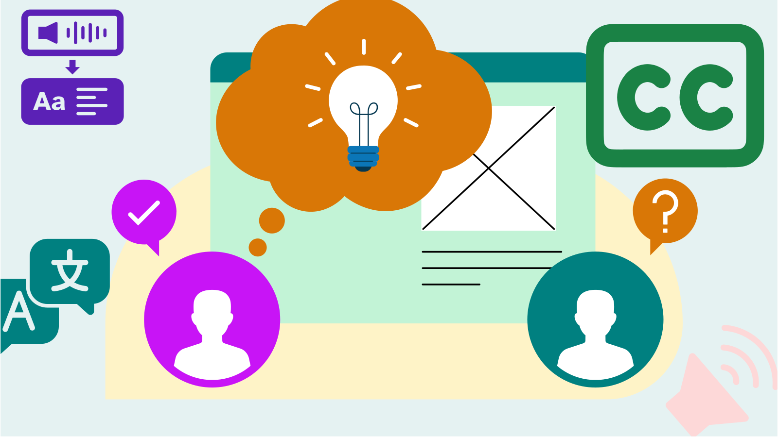
Who said that, and is it normal for them?
Two questions that sound trivial, that most user testing platforms structurally cannot answer, and that between them decide whether anything you measure from a session transcript is valid or worthless. Here is the infrastructure we built to answer them, the hypothesis we built it to test, and an honest account of what we can and cannot yet claim.
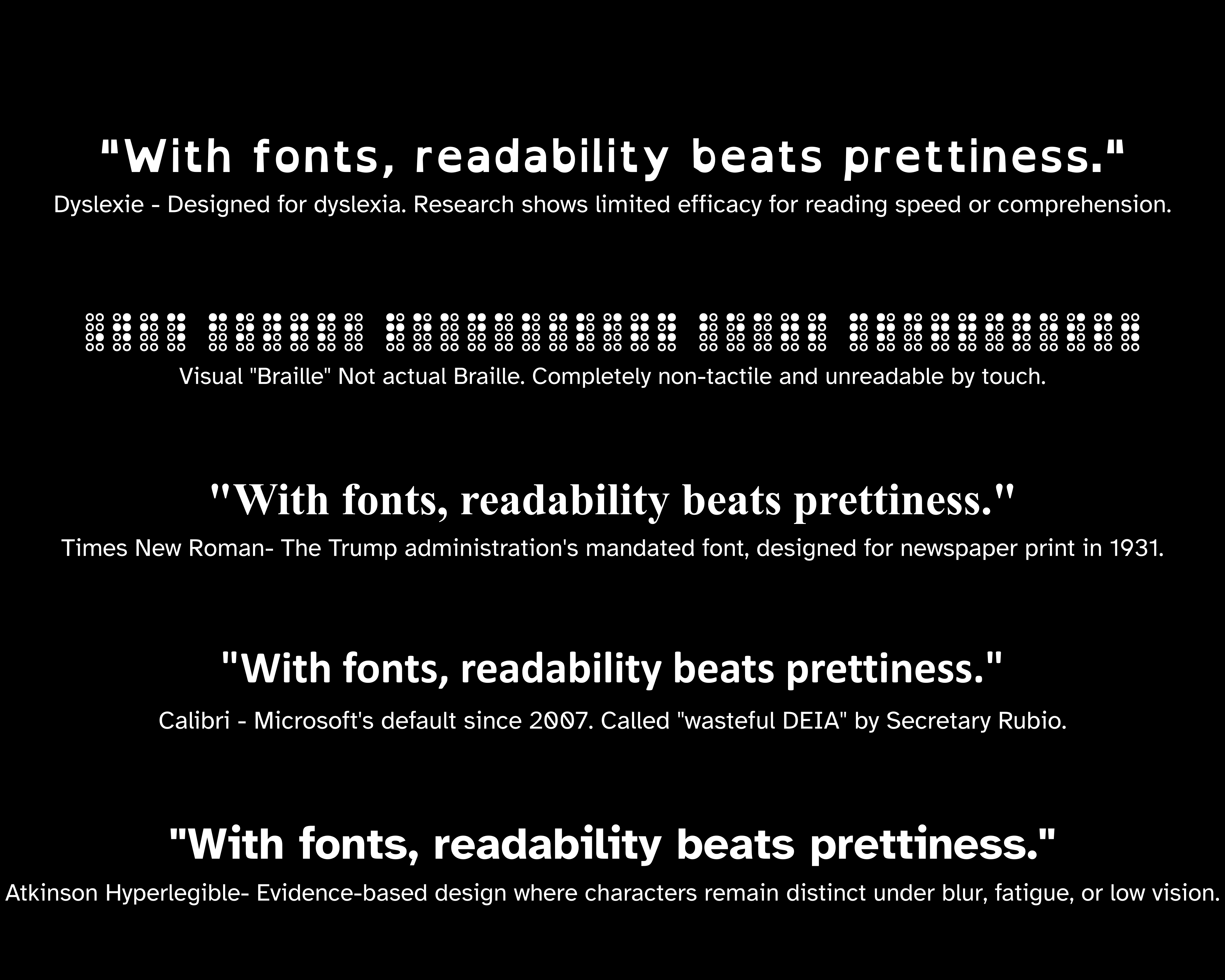
For the Typography Nerds
If two characters could ever be confused, they shouldn't look similar even if that breaks typographic tradition...Atkinson Hyperlegible!
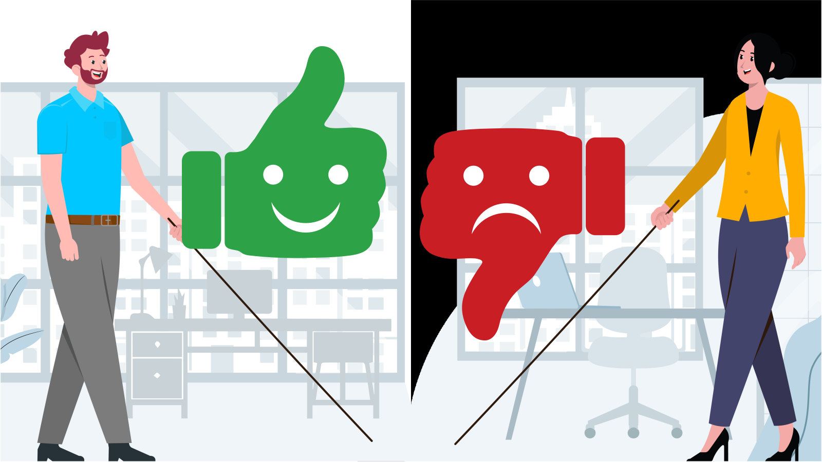
The Say-Do Gap: Why Self-Reported Usability Scores Overstate Real-World Experience, and Why the Size of the Gap Depends on Who’s Reporting
Published by See Me Please | Data source: 125 paired raw-vs-calibrated scoring events (curated subset) and 1,500 paired raw-vs-calculated scores (full sample), across 15 usability studies, 2026
The Blind Spot in Self-Report: Why the Users With the Worst Measured Experience Rate It the Most Generously
A research note from See Me Please | Data source: 1,500 paired self-report and calculated scores across 15 usability studies, 2026
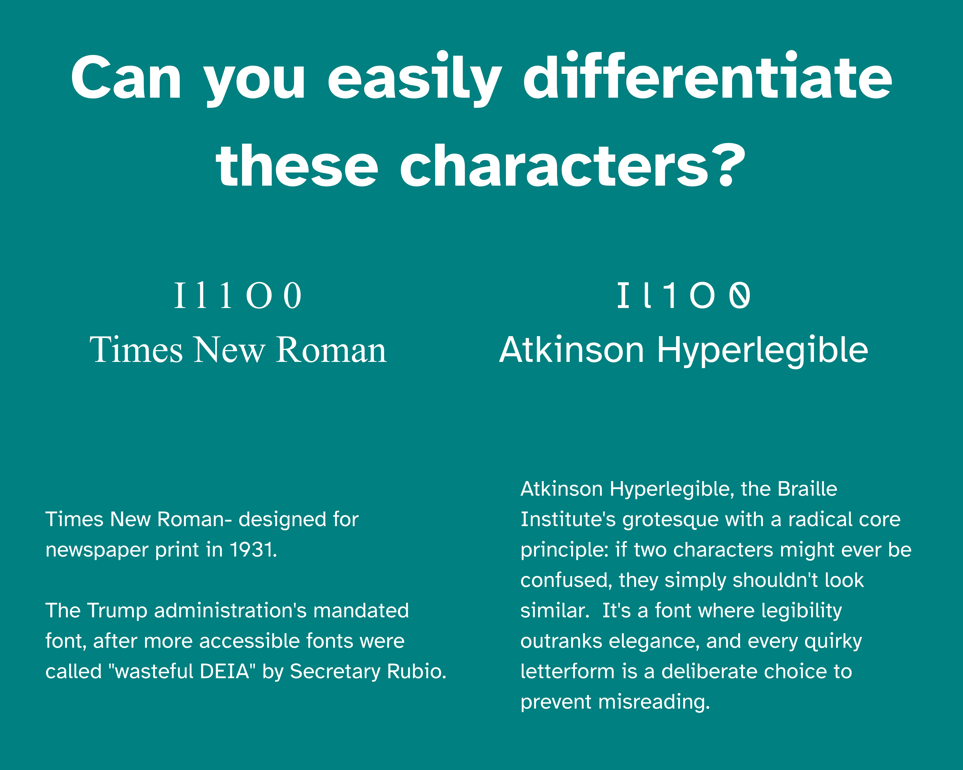
Trump Gov thinks Calibri is woke; US typography just regressed to 1931
The Trump administration just mandated Times New Roman across all Department comms to "restore decorum." While the State Department cosplays 1931, this blog pays homage to a font actually built for this century...one for the type nerds.

Comprehension, Not Just Access: Why Content Clarity Is the Most Frequently Flagged Usability Failure We Measure
Published by See Me Please | Data source: 15 independent usability studies, 5,733 approved individual test findings, 2026
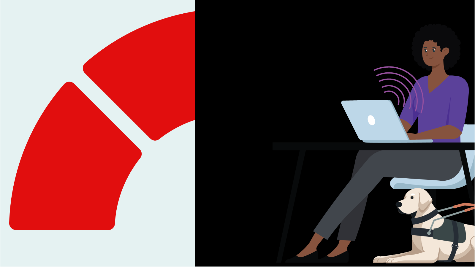
The Accessibility Score Gap: Why Blind and Low-Vision Users Rate the Same Digital Products Up to 38 Points Lower
Published by See Me Please | Data source: 15 independent usability studies, 67 testers across 221 testing sessions, 5,733 approved test findings, 2026
Authentication...When Logging In Becomes the Lockout
Well-meant accessibility tweaks often backfire when they’re not co-designed with the people they serve. This short video shows how a tiny detail in authentication can slam the front door shut for those who need digital services most.
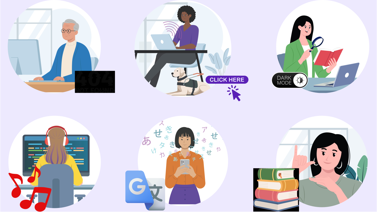
What Breaks for Whom: Friction Patterns Across Nine Disability Cohorts in Usability Testing
Published by See Me Please | Data source: 15 independent usability studies, 3,197 cohort-tagged friction findings, 2026
The 20 Most Common WCAG 2.1 Failures We Found Across 2,481 Real Usability Test Findings
Published by See Me Please | Data source: 15 independent usability studies, 7,027 synthesised findings, 2,481 WCAG-tagged findings, 2026
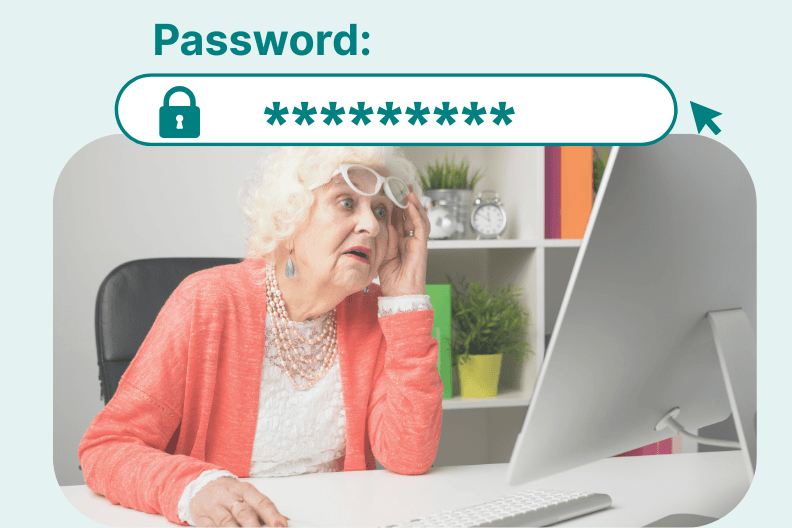
Older Users Might Be Your Best Usability Hack
Brutally Honest But Golden Feedback For Designers
Accessibility testing: how to test beyond WCAG compliance
Because a green tick is not the same thing as a good experience.
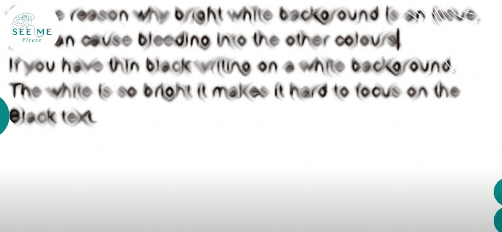
Dark Mode - Essential not a Preference
Dark mode is often treated as a nice-to-have rather than a necessity or assistive technology.

Invisible Digital Barriers In Gov
This blog explores the critical need for inclusive digital government services, highlighting the often-invisible barriers that exclude millions of citizens from essential services.
What is WCAG? A practical guide from See Me Please
Because a technical standard is useful. A human experience is the point.
What is accessibility?
Why the better question is whether something is universally usable