Key data points
- Of 7,027 synthesised findings across 15 independently tested digital products, 1,468 (20.9%) were logged as positive, a pattern that worked well enough for testers to call it out unprompted, rather than a friction point or blocker.
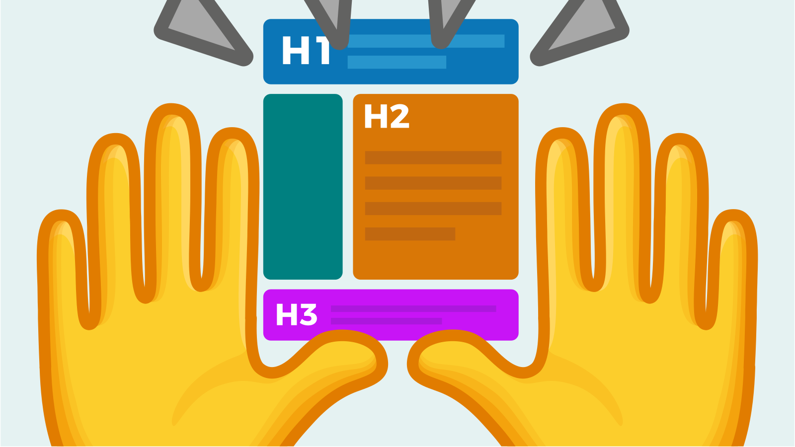
- 34.3% of all positive findings relate to clear heading structure and content organisation, by far the single most common theme in the positive-findings dataset.
- 15.7% relate specifically to compatibility with screen readers, keyboard navigation, or browser zoom: evidence that when these are built correctly, users notice and comment on it.
- 10.2% relate to clean, uncluttered visual design or effective use of icons for scanning; another 10.2% relate to testers expressing trust or connection to the product’s purpose, independent of any usability mechanic.
- Content structure is the only theme that is simultaneously the top category of positive findings (34.3%) and maps to the second-most common WCAG failure categories in the same dataset (1.3.1, Info and Relationships, and 2.4.6, Headings and Labels): the same design decision is the biggest differentiator between products that work and products that don’t.
Testing programs over-index on what’s broken
Usability and accessibility testing is designed to surface problems, so most of what gets published from testing data is a list of failures. That’s useful for triage, but it under-serves a different and equally important question: when a product genuinely works well for a tester with a disability or an access need, what does that actually look like in practice? Across 15 independently tested products, 1,468 findings, just over a fifth of everything logged, were positive rather than friction-based, giving a large enough sample to identify which specific design decisions are being noticed and praised across otherwise unrelated products.
What gets praised, ranked by frequency
| Theme | Share of positive findings | What it typically looks like |
|---|---|---|
| Clear heading structure / content organisation | 34.3% | Descriptive, non-duplicated headings; predictable page hierarchy; grouped, scannable sections |
| Screen reader, keyboard, or zoom compatibility | 15.7% | Controls that are fully operable and correctly announced without a mouse or with magnification active |
| Clean visual design / effective icon use | 10.2% | Uncluttered layouts; icons that support quick visual scanning without depending on colour alone |
| Trust and connection to purpose | 10.2% | Testers expressing that the product’s mission or tone made them more willing to engage, independent of any specific interaction |
| PDF and document accessibility | 8.9% | Documents that remain navigable and readable with assistive technology, including working internal links and proper reading order |
| Plain, non-clinical language | 8.6% | Content that avoids jargon and technical terminology without talking down to the reader |
| Clear form and error feedback | 5.9% | Real-time validation, specific error messages, and visible confirmation that input was accepted |
| Effective search | 5.5% | Search that compensates for weaker navigation or surfaces relevant results without requiring exact terminology |
The structure finding is the most important one in this dataset
Content structure (clear headings, predictable organisation, logical grouping) is not just the single most common positive theme at 34.3%; it is also, from a separate analysis of this same testing program’s WCAG-tagged failures, one of the two most common failure categories (1.3.1, Info and Relationships, tagged 393 times, and 2.4.6, Headings and Labels, tagged 240 times). No other theme in this dataset shows up as simultaneously the top strength and a top-two weakness. That combination is a strong signal that structure (more than colour, more than icon choice, more than micro-copy) is the single design decision most correlated with whether a product feels usable at all, in either direction. Products that get heading hierarchy and content grouping right are disproportionately likely to be the ones generating positive findings; products that get it wrong are disproportionately likely to be the ones generating one of the most-cited accessibility failures in the dataset.
Accessibility features are noticed, not just tolerated
15.7% of all positive findings specifically credit screen reader compatibility, keyboard operability, or zoom support, meaning testers are not simply failing to complain about these features when they work, they are actively calling them out as a good part of the experience. This matters for how accessibility investment gets justified internally: it is not purely defensive or compliance-driven work that goes unnoticed when done well. In this dataset, it is one of the largest single categories of things testers specifically praised.
Plain language and trust operate somewhat independently of interface mechanics
Two of the eight themes, plain language (8.6%) and trust/connection to purpose (10.2%), are notable because they aren’t primarily about interface mechanics at all. Positive findings in these categories describe testers responding to content and tone: relatable, non-clinical wording, and a sense that the organisation’s purpose came through clearly. This is a reminder that a technically well-built, fully conformant interface can still fail to connect if the content itself reads as bureaucratic or impersonal, and conversely, that content and tone can meaningfully improve a tester’s experience of a product even where interface polish is limited.
Frequently asked questions
What design pattern is most frequently praised in usability testing?
Across 1,468 positive findings from 15 independently tested digital products, clear heading structure and content organisation was the most common theme, accounting for 34.3% of all positive findings, more than any other category measured.
Do testers actually notice good accessibility work, or only bad accessibility work?
Both. 15.7% of all positive findings in this dataset specifically credited working screen reader compatibility, keyboard navigation, or zoom support, indicating these features are actively noticed and valued when implemented well, not just silently expected.
Is there a connection between what usability testing flags as a common failure and what it flags as a common strength?
Yes, and it’s the strongest pattern in this dataset: content structure (clear headings and logical organisation) is simultaneously the most common positive theme (34.3% of positive findings) and maps directly to two of the most frequently cited WCAG failure categories in the same testing program (1.3.1 and 2.4.6), making it the single highest-leverage design decision measured across both directions.
About this analysis
Figures in this article are drawn from an anonymised aggregation of 15 independent usability testing projects conducted by See Me Please between late 2025 and mid-2026. Positive-category findings were classified during test synthesis by trained reviewers based on task-based sessions; thematic groupings were derived from keyword analysis of finding titles and descriptions and may undercount findings using less common phrasing. All client and participant identities have been removed.