Key data points
- Across 125 sessions a reviewer flagged for manual score calibration, testers’ raw self-reported satisfaction scores averaged 73.0 out of 100 against a calibrated score of 44.2 out of 100, a gap of 28.8 points. Because this subset was specifically selected for correction rather than drawn at random, treat this as an upper-bound estimate, not a typical one.
- A separate, unselected sample of 1,500 sessions (every session with both a self-report and a calculated score, not just the ones flagged for review) shows a smaller but still substantial average gap of +16.8 points, which we consider the more representative estimate of the general pattern.
- 87% of the curated calibration reviews moved the score down, not up.
- Of the 36 sessions in the curated subset where a tester self-reported a “perfect” score of 100, 30 (83%) were revised downward on review, to an average of 55.6, a drop of 44 points on average for the cases that looked, by self-report alone, like the experience had gone flawlessly.
- The gap is not evenly spread across testers: in the full 1,500-session sample, blind testers show the largest average inflation (+27.0 points) and Indigenous testers show almost none (+0.6 points), see the breakdown below.
The problem with asking users how it went
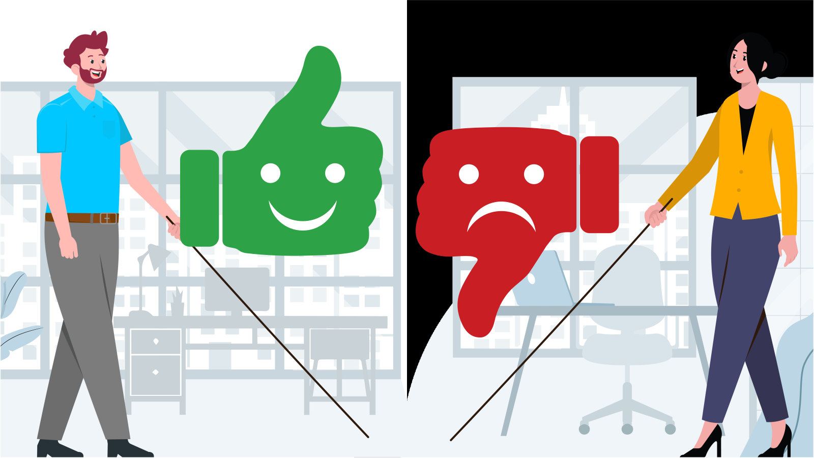
Most usability programs, inside companies and in published research alike, rely at least partly on post-task self-report: “On a scale of 1-5, how easy was that?” It’s fast, it’s cheap, and it produces a number executives can put in a slide. It is also, according to this dataset, a substantially inflated number.
Across 15 independently run usability studies, every test session produced two figures: a raw score based on the tester’s own post-task rating, and a calibrated score produced by trained reviewers watching the same session and applying a consistent behavioural rubric (did the tester complete the task, how many errors or workarounds did it take, did they express confusion or need to backtrack, and so on). Comparing the two scores for the same tester, on the same task, in the same session isolates the gap between stated satisfaction and observed performance, without the confound of comparing different people or different tasks.
The average gap in this curated set was 28.8 points on a 100-point scale, large enough to move a product from “looks broadly fine” to “has serious usability problems” purely by switching from what people say to what they do. One honest caveat before going further: these 125 sessions were not a random sample. They were the sessions a reviewer specifically chose to send for manual recalibration, which likely means they were selected, at least in part, because the raw score looked implausibly generous. Reporting 28.8 points as “the” gap risks overstating how often this happens across a typical testing program.
A broader, unselected check: the gap holds, at a smaller size, and it isn’t even across cohorts
To get a less selection-biased estimate, we separately compared self-reported ratings against calculated scores across every session in this dataset that had both values recorded, 1,500 sessions in total, not just the ones a reviewer flagged. The average gap in this full sample is +16.8 points, smaller than the curated figure but still a substantial, directionally consistent overstatement. We consider this the more trustworthy estimate of the general pattern; the 28.8-point figure above is better read as what the gap looks like in the more extreme cases a reviewer catches, not as the typical case.
The more useful finding from this larger sample is that the gap size varies a great deal by cohort, and not randomly:
| Cohort | Sessions | Average gap (self-report − calculated) |
|---|---|---|
| Indigenous | 56 | +0.6 |
| Deaf | 190 | +10.1 |
| Physical disability | 38 | +11.3 |
| Low vision | 271 | +13.7 |
| Over-65 | 123 | +14.2 |
| Limited English proficiency | 242 | +15.7 |
| Neurodivergent | 207 | +19.1 |
| Blind | 373 | +27.0 |
Blind testers, separately shown to have the lowest calculated accessibility score of any cohort in this program, show the largest self-report inflation of any group, at +27.0 points on the largest sample in this table. Indigenous testers show almost no gap at all. One plausible hypothesis, worth testing rather than assuming, is that the friction blind testers encounter has effectively been normalised: because navigating around inaccessible design is something many blind testers do routinely, across most digital products they use, not just the one under test, that friction may no longer register as strongly in the moment of self-report, even where the calculated difficulty score is high. This is a distinct, separate consideration from ordinary survey fatigue, which may also be contributing to the inflation seen across cohorts generally: by the point a self-report question is asked, particularly after a longer or more effortful session, which navigating with assistive technology can often involve, a tired tester may be more inclined toward a quick, rounded-up answer than a fully considered one. Neither explanation is established by this dataset; both are plausible, and not mutually exclusive, mechanisms consistent with the pattern and worth investigating directly rather than treating as settled. We go into the likely explanations for this pattern, including adaptive expectations and relief bias, in a dedicated piece on self-report bias by cohort; the short version is that the group with the worst measured experience appears to be the group least likely to describe it that way in their own words.
Perfect scores are the least reliable signal
The most striking pattern in the data isn’t the average gap: it’s what happens at the top of the scale. Testers gave a raw score of exactly 100 (“no problems at all”) in 36 of the 125 paired sessions. On review, 30 of those 36 sessions (83%) were revised downward, landing at an average calibrated score of 55.6. In other words: a tester reporting a flawless experience was, four times out of five, still observed making errors, needing workarounds, or failing parts of the task when the session was actually reviewed.
This matters because a “100” is exactly the kind of result that tends to get taken at face value: it’s the response that looks least like it needs a second look. The data suggests the opposite: self-reported perfect scores in usability testing warrant more scrutiny, not less, because they are the category most likely to be overstating the real experience.
Why the gap exists
A few explanations are consistent with the pattern in this dataset, and they aren’t mutually exclusive:
Task completion and satisfaction are different constructs, and people conflate them. A tester can technically finish a task, eventually, and still rate it highly simply because they got there, even if the path involved several wrong turns, re-reads, or moments of confusion that a behavioural rubric would score as friction.
Social desirability and effort justification play a role in any moderated or semi-moderated study. Testers know a person or a company is on the other end of the session, and there is a well-documented tendency to round scores upward rather than deliver pointed criticism, especially when the tester has just spent effort completing the task and doesn’t want that effort to feel wasted.
Recall is short and recency-biased. A five-point post-task scale captures a single overall impression formed seconds after finishing, while a calibrated behavioural review can weigh the entire session, including the parts the tester may have already mentally discounted or forgotten by the time they’re asked to rate it.
A fourth explanation is suggested by the cohort breakdown above rather than the aggregate gap: expectations may be calibrated to lived experience rather than to some external ideal. A tester who has spent years navigating inaccessible products may reasonably rate a session well relative to their own baseline, even when a reviewer applying a fixed, external rubric would not. This wouldn’t make the self-reported score “wrong” so much as answering a different, more personal question than the one a behavioural rubric is designed to answer, and it’s consistent with why the size of the gap tracks cohort so closely rather than looking uniform.
What this means for how testing programs should be designed
Three implications follow directly from these findings, a representative average gap of roughly 17 points (rising well above that for specific cohorts, and higher still in the more extreme cases a manual review catches) and an 83% downward-revision rate on “perfect” scores in the curated subset:
Self-report alone is not a reliable input for structural decisions. A single satisfaction number, taken without a behavioural cross-check, systematically understates how much a product needs to improve, and understates it most for the cohorts already experiencing the worst outcomes. Teams using post-task ratings as their primary success metric are very likely underestimating how much friction remains, particularly for blind and neurodivergent users.
Perfect or near-perfect scores should trigger review, not confidence. Given that 83% of raw scores of 100 in this dataset were revised down, a spike of perfect self-reported ratings is a better trigger for a manual behavioural spot-check than a signal to move on.
Pairing self-report with behavioural observation, even for a subsample, is enough to calibrate the gap. This dataset didn’t require reviewing every session behaviourally: a directional correction of roughly 17 points as a general baseline, adjusted upward for cohorts known to show larger gaps (blind and neurodivergent testers in particular), is a practical, resource-efficient way for teams without capacity to behaviourally review every session to still correct for the bias.
Frequently asked questions
How much do self-reported usability scores overstate the real experience?
Estimates vary by how the comparison is made. Across an unselected sample of 1,500 sessions, self-reported scores averaged 16.8 points higher than an independently calculated behavioural score, the more representative figure. Among a smaller set of 125 sessions specifically flagged for manual recalibration, the gap was larger, at 28.8 points (73.0 vs. 44.2 on a 100-point scale), an estimate of the more extreme end of the pattern, not the typical case.
Does the self-report gap affect every cohort equally?
No. In the 1,500-session sample, the gap ranged from +0.6 points for Indigenous testers to +27.0 points for blind testers, more than a 40-fold difference in the size of the overstatement, despite both groups rating real sessions on the same scale.
Are “perfect” usability scores trustworthy?
Not reliably. Of the sessions flagged for manual review where a tester self-reported a perfect score of 100, 83% were revised downward on independent review, to an average calibrated score of 55.6.
Why does self-reported satisfaction diverge so much from observed behaviour in usability testing?
The gap is consistent with testers conflating “I eventually finished” with “it was easy,” social pressure to round scores up in a moderated session, short recency-biased recall at the point of rating, and, based on how unevenly the gap is distributed by cohort, expectations calibrated to lived experience rather than to an external standard.
About this analysis
Figures in this article are drawn from an anonymised aggregation of scoring data across 15 independent usability testing projects conducted by See Me Please between late 2025 and mid-2026. Two separate comparisons are reported: 125 paired raw-versus-calibrated events, reflecting sessions a trained reviewer specifically selected for manual recalibration under a documented methodology (likely biased toward larger, more obvious gaps); and 1,500 paired raw-versus-calculated scores, reflecting every session in the dataset with both values recorded regardless of whether it was flagged for review (the more representative estimate). All client and participant identities have been removed.