
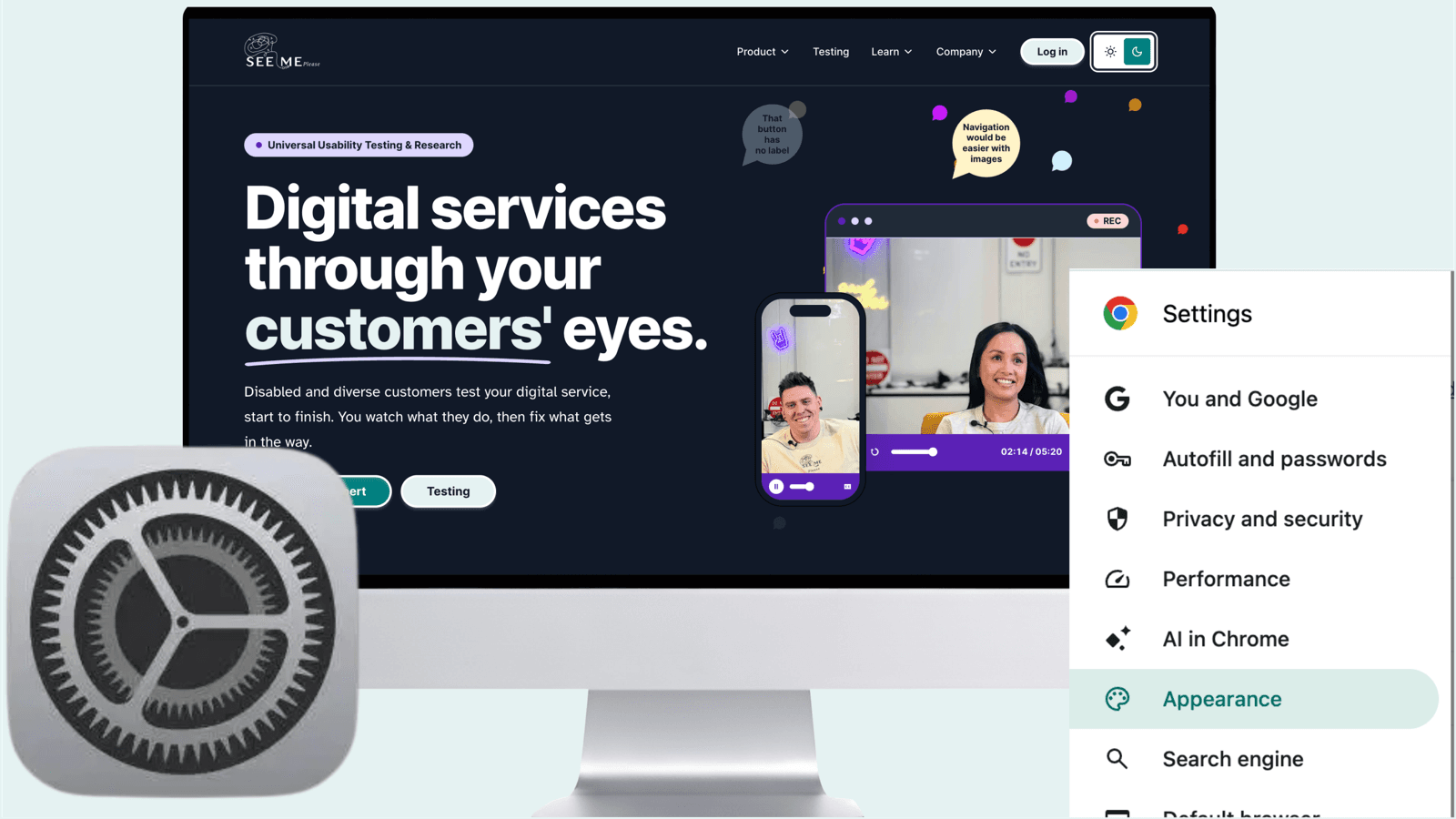
‘Know your customer.’ ‘Customer obsessed.’ ‘Tell us once.’ We’ve built an impressive vocabulary for the kind of relationship organisations want with their customers. But there’s a remarkably ordinary test of whether we mean any of it: when someone has already expressed a preference, does the product respect it?
Your laptop may know you prefer dark mode. Your phone may know you want less movement. Your browser may communicate that you need greater contrast. These aren’t vague signals inferred from a marketing segment or a predictive model. They’re choices people have made for themselves.
And yet digital services still frequently treat each new visit as a fresh negotiation. Find the settings. Change the colours. Increase the text. Switch off the animation. Then do it again on the next site.
What makes this strange is that the web already has ways to ask. Some excellent products use them. Most of us have probably experienced the result without knowing why it felt so effortless.
Good company, very little ceremony
Open GitHub on a computer that prefers dark mode. If you haven’t set a different GitHub theme, its documented default is to follow your system. You arrive in a dark interface. There is no onboarding question about your eyes and no detour through Appearance settings. The service follows a choice you made elsewhere.
GitHub goes further: it lets people choose separate light and dark themes, including high-contrast and colour-blind-friendly variants. Someone can follow their computer’s day/night switching but decide what each state actually looks like. Or they can choose a fixed theme and ignore the system altogether. That's an unusually good distinction between listening and insisting.
Wikipedia offers another thoughtful version of the idea: Light, Dark and Automatic. Its Automatic choice follows the effective browser preference, while its reading controls also let people adjust text size and page width. MDN Web Docs offers OS Default alongside explicit light and dark options. None is identical. All acknowledge that the customer may arrive with a preference worth respecting.
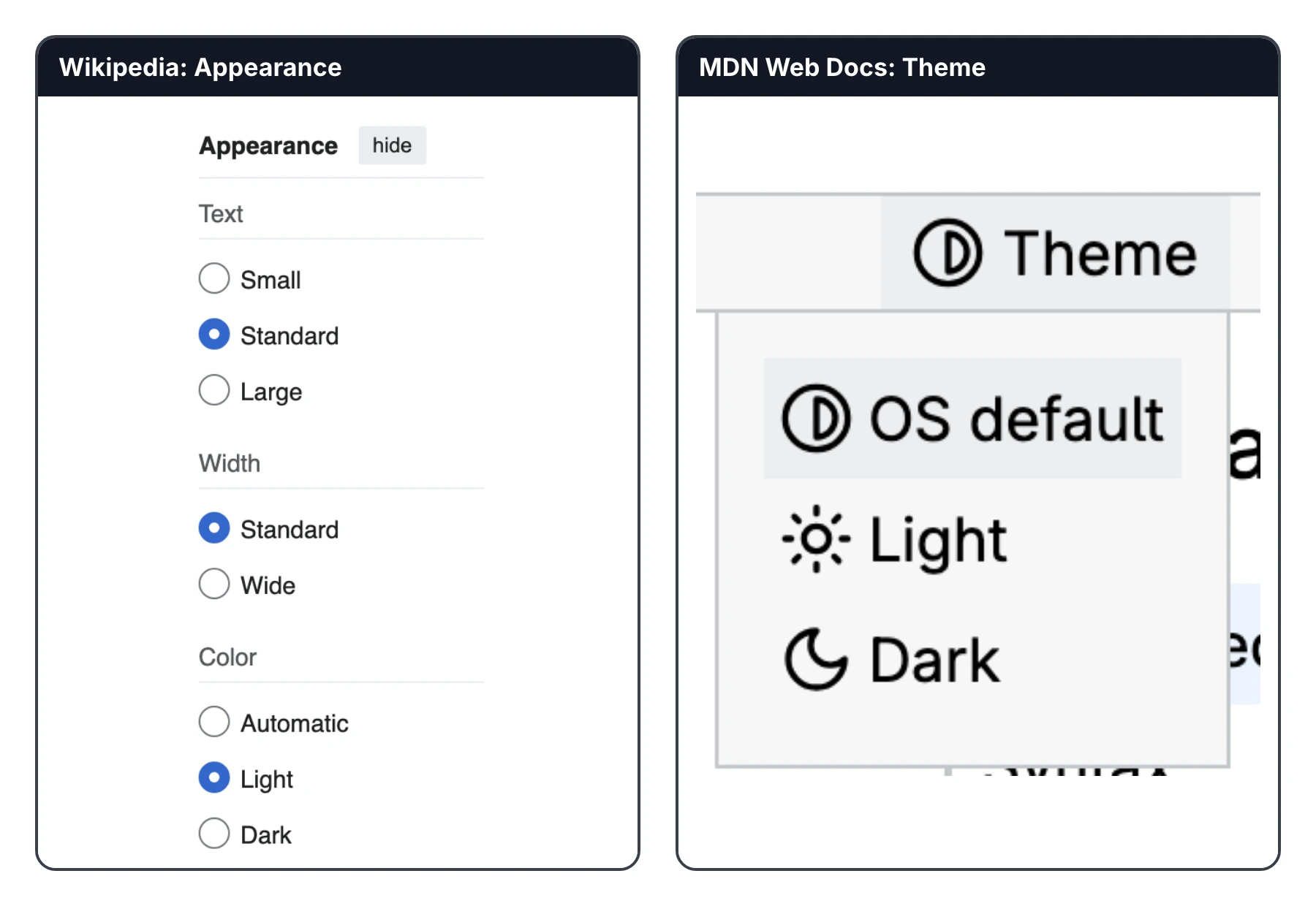
I wouldn't claim these products are the only ones doing this, or that every person receives the same automatic behaviour. Wikipedia's Automatic, for example, must be selected; GitHub's explicit theme can override the system. What puts them in good company is the quality of the interaction: an inherited preference, an understandable local choice, and a graceful way to change your mind.
That last point is important. Respecting someone's preference isn't an instruction to obey the device forever. It's recognising that the customer has already spoken, without denying them the right to speak again.
The same small courtesy can mean very different things
A software engineer might prefer dark mode because it matches their development tools. Someone else might need a darker interface because bright screens are painful. A larger text setting might be essential to one person and simply comfortable on a small phone for another. Captions can enable a Deaf person to follow a film; they can also help a commuter watch without headphones.
This is where the usual separation between ‘customer experience’ and ‘accessibility’ starts to look artificial. Good preference handling doesn't need to identify someone as disabled, estimate their age or ask for a medical explanation. It just needs to honour an explicit choice.
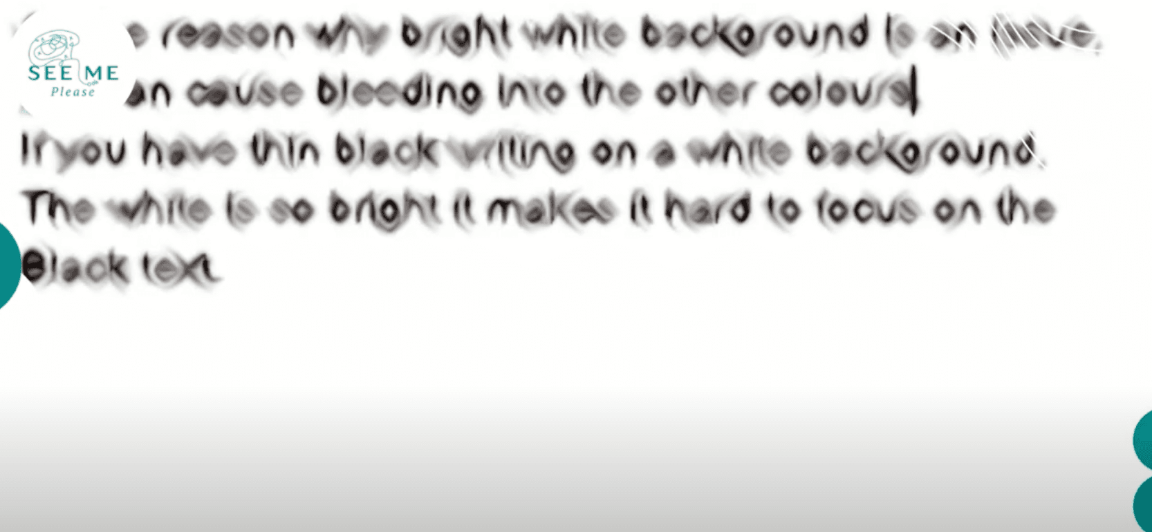
Consider colour inversion. Someone who struggles with an intensely bright interface may invert their device colours to make the page bearable. That can help, but the blunt inversion also turns photographs into negatives and can make visual meaning harder to interpret. The person has to keep compensating: adjust the display, inspect the image, adjust it again, move to another service. The work that belonged in product design has landed with the customer.
A well-engineered dark theme won't solve every visual accessibility need. But it can remove one reason people resort to such workarounds. And the principle extends beyond colour: once a person has requested less motion, why should an unrelated component decide to animate anyway?
The browser is already carrying the message
This is not speculative technology. Browsers expose a set of media features through which websites can respond to the effective preferences of the environment. The simplest is prefers-color-scheme: light or dark. It's what allows a page to select appropriate colours without asking the visitor to find a switch first.
@media (prefers-color-scheme: dark) {
  :root { color-scheme: dark; }
  /* Semantic surface, text and focus tokens resolve to dark values. */
}
There's a subtle but important boundary here. A website usually receives the preference the browser exposes, not a reliable explanation of whether it originated in Windows, macOS, Android, iOS or a separate browser setting. Firefox, for example, can request dark website content independently of the operating system. Good engineering acts on the effective signal instead of pretending to know more about the person than it does.
The same family of signals includes prefers-reduced-motion for people requesting less movement, prefers-contrast where the browser exposes a greater-contrast preference, and prefers-reduced-transparency where supported. Platform and browser coverage differs, so a system must cope with a signal being unavailable without treating silence as an affirmative choice.
Then there's Windows Contrast themes, which reveal something more interesting than another colour option. Under Settings → Accessibility, a person can choose a contrast theme that instructs supported browsers to apply the system's colours. The CSS signal is forced-colors: active. At that point, the website doesn't get the final word on its own palette.
@media (forced-colors: active) {
  .selected-control { outline: 2px solid Highlight; }
  .status-icon { fill: currentColor; }
  /* Don't fight the user's system palette. */
}
Imagine a designer carefully choosing a pale violet focus ring. In a Windows contrast theme, that authored colour might be replaced. An icon that communicated meaning only through its fill might become unreadable. A selected state drawn only as a background colour might effectively vanish. The correct response isn't to force the brand palette back onto the page. It's to preserve the information and let the platform control its appearance.
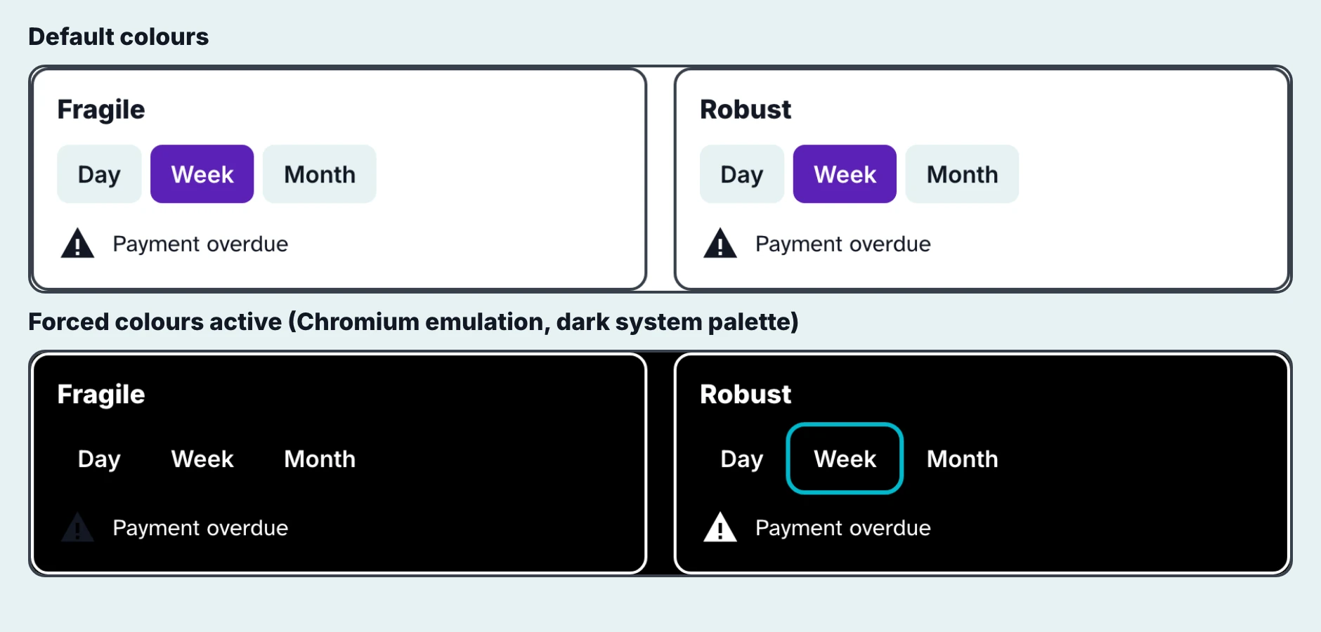
That's a surprisingly useful lesson for design-system teams: sometimes the most sophisticated visual decision is knowing when not to make one.
So why isn't this normal?
If the web has supported preference signals for years, why do so many interfaces still ask customers to start again? Because responding to one signal is easy. Making an entire product respond elegantly is considerably harder.
A simple page can switch colour tokens with a media query. A real service has date pickers, toolbars, charts, video players, modals, form validation, third-party widgets, native controls and perhaps several applications built by different teams over several years. Some have hard-coded colours. Others measure things in fixed pixels. An animation library may never consult the browser's reduced-motion preference. A chart may ask the operating system for light/dark independently of the surrounding page.
And one customer's preferences do not arrive one at a time. Imagine a person who has dark mode and reduced motion enabled on their laptop, uses larger text in the browser, and has chosen more generous spacing within a product. They open a dense dashboard on their phone. The label grows but the field doesn't. The toolbar runs out of room. A small icon button's clickable area collides with the one beside it. The chart switches to dark while the date picker stays light.
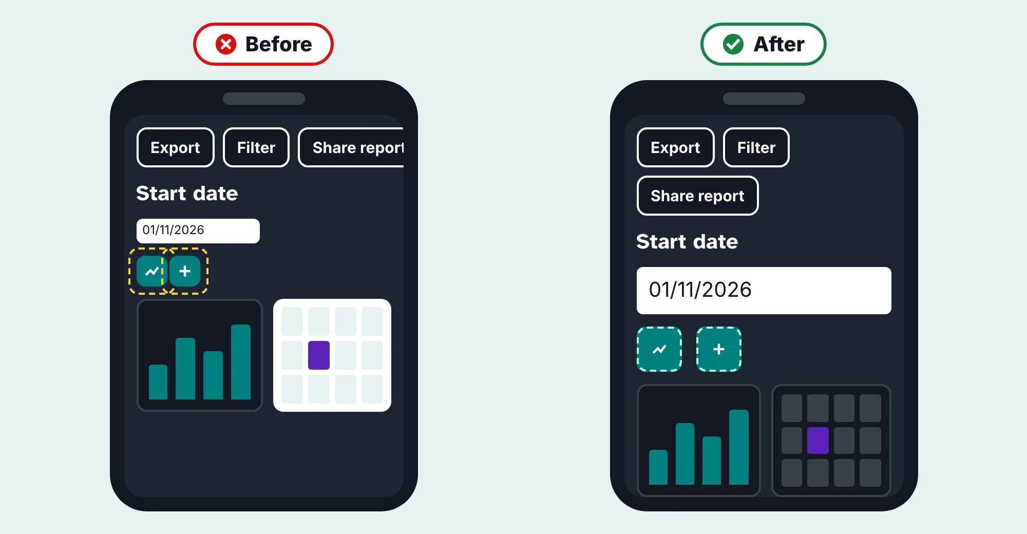
Every component might have been ‘accessible’ in isolation. Together, they create a poor experience. This is why a catalogue of modes is not, on its own, a universal-usability strategy.
The interesting part is what happens when preferences collide
At See Me Please, we've been working on a shared design-system approach rather than another assortment of application-specific toggles. The central engineering idea is to resolve preferences in one place and let every component consume the resulting behaviour through shared tokens and contracts.
Take appearance. A person can make a choice for this tab. If they haven't, a saved product preference takes precedence. If neither exists, the browser's effective device preference is used. Otherwise the product falls back to its approved default. That order respects temporary decisions without silently rewriting a lasting preference. Windows forced colours remains a platform-level exception: when it is active, the site's authored palette must get out of the way.
The hierarchy sounds obvious until a person opens two tabs, changes an account setting, reloads a page or switches their computer into dark mode halfway through a session. The system needs to know what changed, where that preference came from and which decision should take effect.
// Simplified appearance contract — illustrative, not the full API
const appearance =
  tabChoice ?? savedChoice ?? browserPreference ?? 'light';


// A temporary tab choice doesn't rewrite the saved preference.
// Windows forced-colours is honoured separately by the platform.
The next challenge is speed. A React application can make the right decision after it has hydrated and still give someone a sudden flash of white beforehand. That moment is a genuine customer experience failure, particularly for someone who needs a darker screen. Our implementation applies known mode attributes with a small pre-paint script, then uses the same decision contract in the running application. We take care that a correct result isn't preceded by an incorrect frame. We plan to share more of the engineering detail as this work is released.
Then there's the question of scale. Our modes use semantic tokens rather than asking each button, card and field to invent its own settings. With Increase size, for instance, the proposed 125% and 150% steps affect both type and control dimensions. A label growing without its associated field isn't a feature; it's another bug. Visible controls can be compact, but the interaction area still needs to remain sufficiently large and separated from neighbouring targets.
Spacing is treated in much the same way. Rather than multiplying arbitrary margins, the system defines roles such as label-to-field, paragraph-to-paragraph and section-to-section. High spacing moves those roles up a defined scale. A data table can remain comparatively compact while an article remains comfortable, without preventing someone from requesting more breathing room across either.
Reduced motion must work alongside those visual decisions. A device request to reduce motion isn't an invitation for an individual component to re-enable decorative movement. A form can still signal successful submission; a progress indicator can still convey status. Neither requires distracting animation to communicate meaning.
And importantly, not every accommodation should become a mode. Semantic labels, keyboard support, compatibility with password managers and screen readers, sensible text reflow and meaningful focus indication should work for everyone. We don't need to detect a screen reader before deciding that a control deserves a name.
A design system should be able to show its working
Many design systems document the approved colours, dimensions and variants of a component. Increasingly, they publish accessibility guidance as well. But imagine if the specification for a date picker also showed the underlying usability evidence: a consented recording of someone using it with a screen reader, the point where navigation became confusing, the interaction that was redesigned and the automated check that helps prevent regression.
Or consider a compact row of buttons. Our current sizing rules allow a 36-pixel visible control while retaining a minimum 44-by-44-pixel interaction area. That only works if neighbouring hit areas don't overlap. It leads to a design decision that is easy to miss in a static mock-up: leave enough room or let the row wrap. This is the difference between documenting a dimension and documenting why the dimension matters.
We're using automated checks alongside design review to test components in the modes we support. That's valuable evidence, but it's deliberately not the same as claiming a human can complete an end-to-end task comfortably.
Nor are all these modes live today. Light/dark and reduced motion are enabled in the current configuration. Higher contrast, increased size, spacing and colour-differentiation treatments are built and in review, but not yet released. Simpler-content and icon-assisted concepts are earlier in their development. Our most recent work is still in review. That distinction matters: a credible design system should be as clear about its boundaries as its capabilities.
Beyond a compliant component library
The larger ambition is not to create a longer settings menu, or to claim that See Me Please invented the idea of adapting to device preferences. GitHub, Wikipedia and MDN have already shown what thoughtful pieces of this experience can feel like. Browser standards supply much of the technical language. Existing accessibility guidance remains essential.
What interests us is the possibility of bringing the pieces together: customer choices recognised from the first frame; multiple modes that behave coherently; components whose decisions can be understood across different technologies; and a growing body of evidence from people using their own devices, browsers and assistive technology.
A designer should be able to understand not only which date picker to use, but how it behaves at high zoom, under Windows forced colours, with a keyboard, with reduced motion and with a screen reader. An engineer should be able to see the token contract, implementation and tests. And both should be able to encounter the human reason behind the decision.
This is how a design system could become more than a catalogue of attractive components. It could become a practical, evidence-led showcase of universal usability — informed by global best practice, but open to challenge and improvement whenever real customers reveal something it missed.
We've spent years asking customers to tell us who they are, what they want and how they'd like to be served. In the digital world, some of them have already answered a small but important part of that question. The next step is not another form. It's building products that listen.
References
GitHub theme settings: https://docs.github.com/en/get-started/accessibility/managing-your-theme-settings
Wikipedia reading appearance: https://www.mediawiki.org/wiki/Reading/Web/Accessibility_for_reading/Frequently_asked_questions
MDN prefers-color-scheme: https://developer.mozilla.org/en-US/docs/Web/CSS/Reference/At-rules/@media/prefers-color-scheme
MDN forced-colors: https://developer.mozilla.org/en-US/docs/Web/CSS/Reference/At-rules/@media/forced-colors
MDN prefers-reduced-motion: https://developer.mozilla.org/en-US/docs/Web/CSS/Reference/At-rules/@media/prefers-reduced-motion