There's been much (and largely warranted) outrage over the Trump Administration's decision to revert to Times New Roman in order to "restore decorum and professionalism" to the Department's written work. US Secretary of State Marco Rubio went further, describing the use of Calibri, a modern sans-serif font, as "another wasteful DEIA program", also suggesting it was too informal.
While Times New Roman may be free, the consequences aren't. Any perceived savings are quickly eroded by the rework required across government documentation, updates to web experiences, accessibility regression, and increased user friction, which ultimately shifts citizen demand back into higher-cost service channels, not to mention the inevitable reputational fallout responding to the media outrage.
To many, Calibri carried meaning: it represented a quiet nod to accessibility and more modern, inclusive design principles.
Which makes it fair to assume the typeface itself isn't really at the heart of this decision. Rather, the font is being used as a statement about which policy choices the Trump administration values, and which ones it is actively rejecting.
Most people don't have a strong preference for typography, or even notice it at all. Fonts tend to disappear into the background, assumed to be neutral, interchangeable, and largely inconsequential. That perceived indifference is precisely why typography is so powerful.
Because when people don't notice type, it's doing its job. And when a decision about type suddenly becomes visible or contentious, it's rarely about aesthetics alone. Typography carries assumptions about authority, modernity, inclusion, efficiency, and who a system is designed to serve... even if most readers couldn't name the font on the page.
So while few people would claim to care about fonts, there's always more to unpack. Typeface choices quietly encode values, priorities, and trade-offs; between tradition and progress, compliance and usability, symbolism and lived experience. The absence of strong public opinion doesn't mean neutrality; it just means the signals are subtle.
This article takes a tour through three familiar but often misunderstood characters in the accessibility font conversation: the snake-oil theatrics of so-called "dyslexia fonts", the confused application of visual "Braille fonts" that look the part but do absolutely nothing tactile, and, standing head and shoulders above the rest, the undisputed king of inclusive typefaces, Atkinson Hyperlegible, being one of the very few fonts built on evidence, lived experience, and a no-nonsense understanding of what accessibility actually requires [3][4].
Well-Intentioned but over-sold Dyslexic fonts
When people talk about "dyslexic fonts", they're usually referring to two main players: Dyslexie (the original, proprietary font) and OpenDyslexic (its open-source cousin). We haven't conducted a statistically representative study focused solely on dyslexic or neurodivergent users to test these fonts in isolation. However, across years of real-world user testing with diverse cohorts, one pattern has been remarkably consistent: we've never observed a single person choose a dyslexic font as their preference when it's available, nor express a desire for it.
At face value, the idea of a dyslexic font makes sense. Dyslexia was long (and incorrectly) framed as a problem of letter flipping and visual confusion, so the logic followed that heavier, more distinctive, or asymmetrical letterforms might reduce perceptual errors. But modern research paints a different picture. Studies have found that the Dyslexie font did not improve reading speed, accuracy, or comprehension compared to standard fonts (1), while broader research synthesised by the International Dyslexia Association makes clear that the primary challenges in dyslexia lie in phonological decoding and language processing, not simply confusing a b for a d [2]. Changing letter shapes alone doesn't meaningfully address how the brain processes written language.
That doesn't make these fonts useless. Some individuals genuinely prefer them, and personal preference matters. They've also been valuable in prompting conversations about dyslexia, readability, and inclusive design, which is undeniably a good thing. But when dyslexic fonts are positioned in sales decks as a meaningful accessibility intervention, scepticism is warranted. If you're serious about investing time and money in accessibility, the evidence consistently suggests that effort is far better spent on content clarity, spacing, layout, plain language, and overall usability than on a font that promises far more than it can deliver.
In short: an interesting conversation starter, but if someone's selling it as a silver bullet, there's a strong chance you're being sold snake oil.
Um...the "Braille Font" isn't Braille!
We recently user tested a refreshed government website, and it's worth saying upfront: the team's focus on, and commitment to, digital accessibility throughout the redesign was nothing short of impressive. But midway through testing, one option in the accessibility settings stopped us in our tracks. Nestled alongside the expected controls for contrast and text size was a toggle inviting users to switch the site's font to... Braille.
Braille? On a screen? This actually made our blind user testers roar with laughter. A perfect example of how well-intentioned accessibility efforts can sometimes drift into confusion rather than clarity.
"Braille fonts" are one of the most persistent, and misunderstood, ideas in accessibility. To be clear...Braille is not a font. It's a tactile reading system with strict physical standards for dot size, spacing, and height [5][6]. When you see a so-called Braille font on a website or in a PDF, what you're looking at is simply a visual representation of Braille dots...completely flat, non-tactile, and unreadable by touch.
There is value in visual Braille fonts, primarily when designing where and how Braille should sit alongside text in physical signage or posters. But this font does not make digital content accessible to blind users. Real Braille requires physical embossing or refreshable Braille displays, not typography tricks. And refreshable Braille relies on content being correctly structured and efficiently exposed through screen readers [7].
In short, visual Braille fonts are useful in educational contexts, design mock-ups, and awareness campaigns but frequently misunderstood in the digital context. The font is not Braille, and the font alone is certainly not an accessibility solution. If someone's telling you otherwise, you're not getting inclusive design... you're getting theatre.
Some say less beautiful, all say far more useful; Atkinson Hyperlegible
When Atkinson Hyperlegible is available in a product or service we're user testing, we don't need to prompt for feedback; people with low vision always volunteer it. Over and over again, we hear the same thing: "This is easier." "This is a great font." "There's no bleeding of the characters."
Less strain. Less second-guessing. Less fatigue. In contrast to dyslexic and Braille fonts, Atkinson is one of the few typefaces we've seen repeatedly receive unprompted praise by people who genuinely struggle to read conventional text on screens; a pattern that strongly mirrors the original intent and evaluation work undertaken by the Braille Institute during its development [3][4].
The organic response we observe in our user testing isn't accidental.
Fonts like Helvetica are often described as neutral. Atkinson quietly rejects that idea. Neutral for whom? Under what conditions? At what age?
Atkinson Hyperlegible trades so called 'type elegance' for dignity, smoothness for clarity, and aesthetic purity for fewer mistakes and greater autonomy. A trade-off most fonts never explicitly make.
It's optimised for degradation and isn't trying to disappear the way a neutral typeface like Helvetica does. It's trying to remain recognisable when the reader is tired, zoomed in, older, visually impaired, or all of the above.
A useful mental model, and one that aligns closely with what our cohorts surface again and again, is this:
If two characters could ever be confused, they shouldn't look similar — even if that breaks typographic tradition.
Who benefits from type in Atkinson
Atkinson is often misunderstood as a general "accessibility font". It isn't. It was designed specifically for people with low vision, not blind screen reader users; a distinction repeatedly emphasised by the Braille Institute itself [3]. This makes it particularly relevant in mainstream government and banking services, where many users don't identify as disabled but still struggle quietly for example older users.
The Background on Atkinson Hyperlegible
Atkinson Hyperlegible was created by the Braille Institute of America, in collaboration with design studio Applied Design Works, with a very specific audience in mind: people with low vision. Not blind users relying on Braille or screen readers, but people with partial vision who still read visually and often sit in an uncomfortable middle ground where most fonts technically "work", but none work well [3][4].
Before designing anything new, the team tested existing serif and sans-serif fonts, including familiar workhorses like Times New Roman and Frutiger. What they found was telling: even users with moderate vision impairment struggled to reliably distinguish common character shapes. Letters blurred together. Numbers collapsed into ambiguity. Errors crept in where accuracy mattered most. So instead of tweaking an existing typeface, the team started from scratch, prioritising legibility and character distinction over typographic uniformity or classical beauty.
Atkinson Hyperlegible first released in 2019 (and significantly expanded in 2025), is a grotesque sans-serif, a category that traces back to the earliest sans-serifs of the 19th and early 20th centuries. Despite the unfortunate name, "grotesque" never meant ugly; it simply meant non-classical. These fonts were practical, utilitarian, and slightly awkward by design...qualities that make them a surprisingly good foundation for accessibility.
Designed to prevent confusion rather than being 'pretty'
Atkinson Hyperlegible shines most clearly where other fonts fall down: confusable characters.
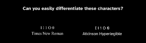
Letters and numbers that are notoriously hard to distinguish, i.e. l, I, 1 and O, 0 are intentionally exaggerated and visually distinct. The lowercase "l" has a pronounced tail. The capital "I" is wider than typographic tradition would normally allow, with clear horizontal bars. The numeral "1" looks unmistakably numeric. The zero carries a distinct slash or shape cue so it can't be mistaken for a capital "O".
In fonts like Arial, Helvetica, or Inter, these characters are far closer in form, often indistinguishable under zoom, glare, cataracts, or reduced acuity. In Atkinson, ambiguity is treated as a design failure.
That distinction matters enormously in real services. These characters show up in passwords, reference numbers, account IDs, verification codes, and URLs; places where mistakes have real consequences in government, banking, and health.
Open counters, exaggerated shapes, and intentional irregularity
Atkinson also uses open counters, the internal spaces in letters like a, e, g, s, and c are larger and more generous than in most fonts. There's less visual "fill" and more white space inside each letter. The shapes themselves are slightly uneven on purpose. Uniformity is sacrificed in favour of recognisability.
Why? Because under real-world conditions like magnification, colour inversion, glare, motion, and fatigue letters tend to collapse into blobs. Open counters and exaggerated features keep characters from merging when contrast degrades.
This is why Atkinson can look a little odd, even clunky, to designers seeing it under ideal conditions. It isn't optimised for perfection. It's optimised for degradation.
Readability under stress, not elegance at rest
In longer passages of text, Atkinson often feels wider and less refined than classic grotesques. But the trade-off is clear: line scanning is faster, word shapes are more distinct, and letters don't bleed into one another as fatigue sets in.
This is where designers sometimes hesitate. Atkinson isn't trying to disappear the way a neutral neo-grotesque like Helvetica does. It's trying to remain recognisable when the reader is tired, zoomed in, older, visually impaired, or all of the above.
Classic grotesque fonts share a few defining traits: minimal stroke contrast, subtle irregularities, compact proportions, and forms that prioritise clarity over elegance. Atkinson inherits that DNA, but pushes it further. Where traditional grotesques often had tight internal spaces, Atkinson deliberately opens them up. Where uniformity was once the goal, Atkinson introduces variation, not for style, but for recognition.
It sits closer to what could be called a functional grotesque: intentionally uneven, intentionally opinionated, and unapologetically practical.
Resilient when users override your design
Another quiet strength: Atkinson performs unusually well when users take control. Increased letter spacing. Increased word spacing. Custom line heights. CSS overrides. Where many fonts fall apart when spacing is forced, Atkinson holds together because its letterforms don't rely on proximity to remain legible.
This makes it resilient in real accessibility scenarios...not just ideal ones.
The 2025 expansion: from niche to workhorse
With the 2025 release of Atkinson Hyperlegible Next, the font gained multiple weights, italics, a variable font axis, and a monospaced variant. That shift matters. It moves Atkinson from a specialist accessibility tool to a system-level typeface that happens to be accessible, rather than the other way around.
Culturally, that's important. It stops accessibility fonts from being marginalised as niche or "special".
Why it matters
One of the quiet problems in digital accessibility is that we've set the bar astonishingly low. Too often, success is measured by passing an accessibility audit...meeting a minimum standard, ticking a compliance box, and moving on. But accessibility audits don't measure whether something is comfortable, efficient, or dignified to use. They don't capture hesitation, fatigue, frustration, or the small errors that compound over time.
What's strange is how inconsistent this is with how we talk about "mainstream" user experience...which, by the way, often includes the very people we're talking about here: older users, people on older devices, users in degraded lighting, and people with disabilities. In mainstream UX, we don't aim for usable; we aim for exceptional, intuitive, even delightful. We obsess over friction, flow, and polish. Yet when it comes to digital accessibility, we rarely even talk about usability at all. Meeting the minimum becomes the goal, rather than designing for outcomes.
Universal usability asks a different question: not "does this pass?", but "does this work well for the widest possible range of people, under real-world conditions?" It shifts the focus from standards to lived experience, from compliance to competence. And that's the difference between designing something that technically functions and something people can genuinely use with confidence.
Atkinson Hyperlegible doesn't exist because WCAG requires it. WCAG doesn't meaningfully address character distinction, ambiguity, or reading fatigue. Accessibility audits don't catch hesitation, and conformance doesn't catch strain. Lived experience does.
Which is exactly why it resonates so strongly with our user testing participants.
If you need a single line to take into stakeholder conversations, it's this:
Atkinson Hyperlegible isn't trying to look accessible; it's trying to prevent mistakes when people are tired, zoomed in, frustrated, or unsure.
And that's what improves the universal usability of online services.
Footnotes / References
Kuster et al. (2018) — Dyslexie font does not improve reading performance Journal of Learning Disabilities.
International Dyslexia Association (IDA) — Dyslexia Basics & Reading Interventions https://dyslexiaida.org (opens in a new tab)
Braille Institute of America — Atkinson Hyperlegible Typeface Overview & Rationale https://brailleinstitute.org/freefont (opens in a new tab)
Applied Design Works — Designing Atkinson Hyperlegible (Elliott Scott, Craig Dobie)https://applieddesignworks.com/work/atkinson-hyperlegible (opens in a new tab)
Braille Authority of North America (BANA) — Braille Standards & Tactile Requirements https://brailleauthority.org (opens in a new tab)
UK Association for Accessible Formats (UKAAF) — Braille and Tactile Reading Guidance
W3C WAI — How screen readers and refreshable Braille displays work https://www.w3.org/WAI/people-use-web/ (opens in a new tab)
15 Facts for design nerds to geek out on...why Atkinson feels weird (and why that's good)
One of the most quietly radical decisions in Atkinson Hyperlegible is the direction of the zero's slash. Instead of the familiar forward slash, Atkinson uses a back-slash diagonal. This avoids visual collisions with Ø and ø in Nordic and Slavic languages, with Đ and đ, and even with mathematical null symbols. It's a tiny decision, but a rare example of accessibility and internationalisation shaping a single glyph.
The lowercase "l" doesn't rely on height to differentiate itself. Instead, Atkinson gives it a small but unmistakable tail. Height is one of the first things to disappear under blur, zoom, cataracts, or glare. Shape persists far longer. This is why the "l" remains recognisable even when everything else starts to collapse.
The capital "I" is deliberately wider than classical grotesque norms would allow. Its horizontal bars are exaggerated and its width is increased so it doesn't collapse into vertical noise when magnified. This breaks typographic convention on purpose, because elegance is less important than preventing confusion in reference numbers, codes, and IDs.
Atkinson's italics are intentionally restrained. They avoid cursive motion, loops, or handwritten characteristics and retain an almost upright skeleton. The philosophy is that italics should signal emphasis, not introduce a second alphabet that low-vision readers must relearn mid-sentence.
Despite many "accessible" fonts switching to a single-storey "a", Atkinson keeps the double-storey form. This isn't conservatism; it's cognitive. The double-storey "a" is more familiar in body text, and research shows that familiarity reduces cognitive load under visual impairment. Simpler isn't always easier.
The lowercase "g" is intentionally asymmetrical. Its bowls are uneven and its joins exaggerated because symmetry increases ambiguity when contrast degrades. Under glare or magnification, symmetrical forms blur into one another; irregularity holds identity longer.
Stroke terminals in Atkinson subtly avoid perfect horizontals. Slight angles and irregularities persist longer perceptually when blur or glare sets in. Perfect horizontals are among the first features to disappear under degraded viewing conditions, so Atkinson quietly sidesteps that failure mode.
Numerals in Atkinson are optically heavier than letters, even though they aren't technically bolder. This gives numbers a grounded, stable presence in text, making tables, financial figures, verification codes, and reference numbers easier to parse without second-guessing.
Spacing is designed to survive abuse. Atkinson holds together when users force increased letter spacing, word spacing, or line height through browser or OS accessibility settings. Many fonts disintegrate when CSS is overridden; Atkinson assumes users will break your layout and plans accordingly.
Philosophically, Atkinson assumes many users won't identify as "disabled". It's designed for people who won't turn on a screen reader, won't ask for help, and won't complain those who just struggle quietly. That assumption makes it unusually effective for older users and low-vision populations in mainstream services like banking, health, and government.
The letterforms actively resist reliance on optical smoothing. While many modern fonts depend on sub-pixel rendering to look good, Atkinson's shapes are chunky enough to hold even when smoothing fails. This matters on older devices, cheap monitors, remote desktops, and degraded display environments.
The font avoids relying on colour contrast to define form. Many contemporary fonts quietly assume high colour contrast to maintain legibility. Atkinson does not. Its internal geometry carries meaning even when contrast ratios are barely acceptable, which is why it performs unusually well in low-contrast or inverted colour schemes.
Counters are designed to survive partial occlusion. Atkinson's open counters are not just large — they are shaped so that even when partially occluded (by glare, bloom, or pixel loss), the remaining shape still conveys the correct letter. This is especially noticeable in e, a, and g, where recognition survives truncation.
Punctuation is oversized relative to body text. Periods, commas, colons, and decimal points are slightly larger and more open than in most grotesques. This reduces missed punctuation in dense content, financial figures, and URLs — places where punctuation carries semantic weight.
Perhaps most radically, Atkinson rejects the modern dogma of typographic neutrality. Where contemporary fonts aim to disappear, Atkinson aims to prevent mistakes. It accepts visible quirks, reduced elegance, and broken uniformity in exchange for dignity, autonomy, and fewer errors. That's not just a design choice — it's a shift in typographic ethics.