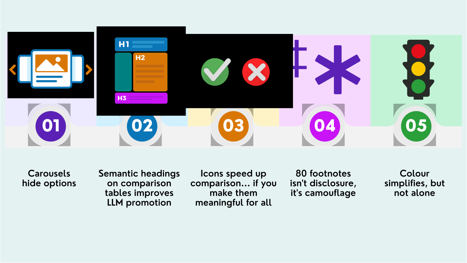
Five comparison-table pitfalls.
Comparison Tables Fail Everyone, Not Just Some
As an early-stage startup, we're genuinely grateful to count some of the biggest insurers, not just in Australia but globally, among our earliest customers. Selling into enterprise is hard. Selling into enterprise insurers, some of the most conservative buyers in any industry, is harder still. After testing the online web brochure experience of insurer after insurer, across market after market, we kept getting struck by the same thing, over and over again: comparison tables. Every time, a slightly different brand, a slightly different product, and the same underlying pattern causing the same friction.
Accessibility is complex, and our mantra has never been to preach perfection.
Progress, not perfection. We know how unrealistic it would be to tell an entire industry to simply stop using comparison tables. So this piece is grounded in pragmatism. It's about simple tweaks not purist advice.
As our participants were browsing cover, generating a quote, working out what a policy actually included..the same problems kept turning up, project after project, brand after brand.
A blind participant would lose the thread of which column they were in. A colourblind participant would stare at a row of ticks and crosses and genuinely not know which plan won. A sighted, digitally confident participant who didn’t use assistive technology was so overwhelmed they’d
just pick the cheapest option, because comparing nine benefits across three plans in three different orders is hard for anyone.That's the part that made us sit up. This wasn't a one-off bug in one insurer's build.
When we aggregated our findings across the insurance sector, the same six design patterns kept reappearing across some of the biggest brands in the market. Not isolated mistakes. A shared convention, repeated so consistently that it has effectively become the industry standard for how cover gets compared, and it's quietly excluding a slice of paying customers every time it's used.
The Comparison Table Isn't the Problem
Let's deal with the obvious objection first, because it's a fair one: comparison tables aren't going anywhere, and they shouldn't. Turning nine benefits across three plans into something a customer can scan in ten seconds is genuinely useful. The convenience is real. Our argument isn't "stop using tables." It's that a handful of small, well-known design decisions quietly turn that convenience into an obstacle for some customers, and a source of friction for almost everyone else.
So this isn't a call for a perfect, ground-up reinvention of how insurance is sold. It's six specific, buildable fixes, most of them a few lines of markup or CSS, that make the format insurers already rely on actually do its job.
We'll go deeper into each one of these issues, but here's the six problem areas:
- No real table structure, so screen readers can't tell what belongs to what (and LLMs probably can’t crawl your services easily either)
- Colour is a great way to simplify information but not when you rely on colour alone (a massive part of the market are colourblind)
- Footnotes and symbols crammed into cells, making the real detail hard to find
- Plans hidden behind carousel arrows where products and options often get missed entirely.
- Rows that don't line up across plans, so nothing can be compared side by side
Why This Matters Commercially, Not Just Ethically
Three things are true at once, and together they reframe the whole conversation:
- It's not a minority. Roughly 20% of the population have a disability, you then add customers who are older and who speak English as a second language, and you’re talking about considerable market share.
- The fixes help everyone. Sticky headers, aligned rows and plain language aren't "accessibility features." They cut comparison time and abandonment for your whole audience, not just the cohort they were originally designed for.
- AI reads tables too. Clear structure and accessible text can also help automated LLMs crawl and nterpret product information. Semantic markup has become more than just an accessibility consideration; it’s an enabler for product discoverability.
And the stakes are higher than they look: 74% of consumers abandoned a purchase in the last three months because the decision felt too overwhelming, according to Accenture's Consumer Pulse Survey in 2022. A comparison table that can't actually be compared makes that worse, and pushes attention onto the one axis that needs no memory or effort to read: price. Which is exactly how a customer ends up picking the cheapest plan with the worst cover.
The Six Patterns We Kept Seeing
Each one below covers what the failure looks like, who it generally affects, and a specific, buildable way to fix it. A few are genuinely disability-specific. Most turn out to be everyone problems wearing an accessibility label.
1. Tables that don't actually read as tables
Comparison tables can look clear while leaving screen reader users unsure what each value refers to. When plan names and benefits are connected only through visual layout, an “Included” cell can lose its meaning.
- Who it affects: screen reader users who need to identify and compare benefits across plans.
- What goes wrong: without properly marked headers, users may encounter values without reliable information about which plan or benefit they describe.
- The fix: use a native HTML table. Mark plan names as column headers and benefits as row headers using <th> and the appropriate scope. Add a descriptive <caption> to identify the comparison. Preserve these relationships in mobile layouts.
A practical check: use a screen reader’s table-navigation commands to move across plans and down benefits. Check that each value’s plan and benefit can be identified. Ordinary table cells aren’t Tab stops, and screen readers vary in how they announce headers, so don’t require one exact spoken sentence. The goal is clear, reliable context throughout the comparison.
2. Colour doing all the talking
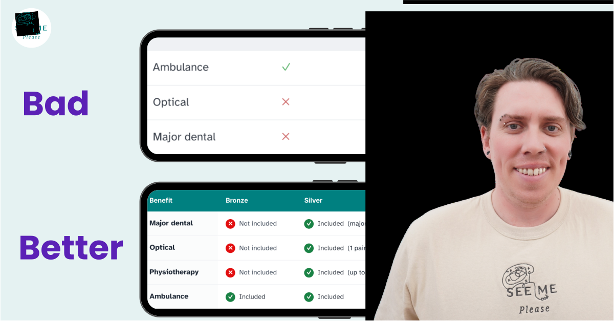
Red crosses and green ticks are the classic insurance-table move, and they're a problem for more people than you'd think. Some insurers, just include red and green dots as indicators of whats included.
Roughly 1 in 12 men has some form of colour blindness, and red-green is by far the most common type. Strip the colour away, or view the page in greyscale, and the entire "what's in, what's out" layer disappears completely.
Before we give you some tips we want to be clear that red and green as a way to simplify information is awesome. Just not when you rely on colour alone or when the contrast is very poor. Do not ditch the colour indicators; just ensure the information is available in different ways.
- Who it hits: colourblind customers directly, but also anyone reading on a low quality screen, in bright sunlight, or from a black and white printout of a policy comparison, which happens more often than you'd expect with older customers.
- The fix: pair colour with shape and text, every time. The icon can stay decorative; the word does the actual work:
<td>
  <span
    aria-hidden="true">
    ✓
  </span>
  Included
</td>
<td>
  <span
    aria-hidden="true">
    ✕
  </span>
  Not included
</td>
Good rule of thumb: Always provide a clear alternative to colour, ideally an explicit text label, so the meaning survives even in greyscale.
3. Footnote and symbol soup, inside the table itself
We actually felt compelled to write a standalone piece about how the prolific use of footnotes fails insurance customers on their own.
The same problem shows up inside comparison tables, just compressed:
"Dental cover ✓ *† (see notes 3, 7)"
This crams three separate symbol systems into a single cell, with the detail that actually changes the decision sitting somewhere else entirely. Working memory is limited; research often places capacity at around four chunks of information under controlled conditions. Chasing a symbol to a footnote and back, while trying to hold a comparison in your head, blows that budget fast.
Who it hits: genuinely everyone. This one isn't a disability-specific issue, it's a cognitive load issue that gets worse for neurodivergent readers, older customers and anyone reading in a second language, but it slows every single customer down.
The fix: put the caveat inline, in plain words, or behind one single, consistently labelled expander per cell. One mechanism, one meaning.
Replace "Dental ✓*†" with "Dental, major only, 12 month wait."
If a caveat genuinely won't fit inline, use one consistent "Details" control that expands in place, never a scavenger hunt across five different symbols.
4. Plans hidden behind carousel arrows
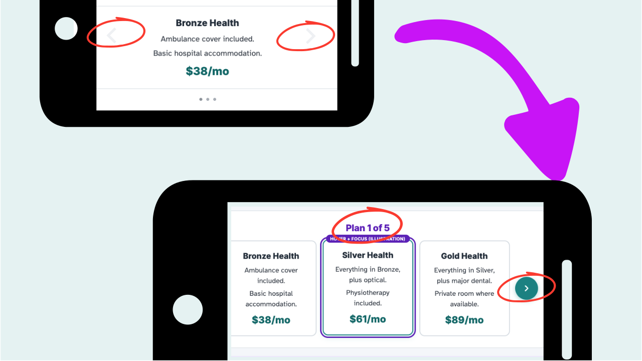
Quote options in a carousel with nothing but left and right arrows assumes the customer's eye naturally catches the periphery.
For someone with restricted peripheral vision, which can occur with conditions such as glaucoma (the risk of glaucoma increase with age, particularly when over 60), or even just someone in a hurry, those side arrows sit outside their visual field entirely.
Around 1 in 4 adults over 71 has some form of visual impairment. If a customer doesn't know there are eight more plans to see, you haven't hidden a design flaw, you've hidden choice (maybe a sale)
- Who it hits: people with tunnel vision or low vision most acutely, but also anyone quickly scrolling on mobile who simply doesn't register that a carousel is a carousel.
- The fix: this seems very simple, but just start with a visual check on the prominence and contrast of those little arrow markers if you use a carousel. Then, 2. something like a central, textual "Plan 3 of 12," as a visible progress indicator, a "peek" of the next card so it's obvious there's more, and 3. always, a "view all as a list" escape hatch.
Never make the carousel the only path to a plan.
5. Rows that don't line up
When each plan lists its own inclusions in its own order, and simply leaves out what it doesn't cover, a customer can't scan a single benefit across the columns. The brain gives up on the multi-variable comparison and falls back on the one axis that lines up by default: price.
- Who it hits: everyone, again. This is pure cognitive load, and it's arguably the single biggest reason customers stop comparing properly and just buy on price, even when the cheapest plan carries the highest excess.
- The fix: one fixed row per benefit, in the same order across every column, and an explicit "Not included" rather than a blank cell.
Never leave a gap to imply "no," a blank is ambiguous to a screen reader and to anyone quickly skimming the page. Alignment is genuinely what turns a list into a comparison.
6. The plan name that scrolls away
In a long comparison table, plan names can disappear as customers scroll through benefits. Customers may need to return to the top to check which policy a value belongs to, then find their place again. Keeping plan names visible can reduce this back-and-forth and the need to remember column labels.
- Who it affects: people visually comparing long tables, particularly those who find it difficult to hold information in working memory.
- The fix: keep the plan-name header row visible while customers scroll through the table. For tables that scroll horizontally, consider keeping the benefit column visible too, provided enough space remains to read the values.
Use opaque backgrounds to keep sticky labels readable. Separately, ensure sticky headers and columns do not cover focused links or buttons. Set appropriate scroll padding on the scrolling container to account for the space they occupy, and test with keyboard navigation, enlarged text and narrow screens. Retain semantic table headers so screen reader users can identify the same relationships.
A practical check: halfway through the table, can customers still identify the plan and benefit for each value? When moving forwards and backwards through interactive controls with Tab and Shift+Tab, does each focused control remain visible?
The Consolidated Checklist
If you only take one page of this away, take this: the decisions behind all six issues, in one list.
- Mark the table up as a real table: <table>, <th>, scope, and a <caption>.
- Never rely on colour alone. Every colour coded state also carries text or shape.
- If a tick or cross conveys real information, make sure the meaning also exists as text.
- Hit real contrast: text at 4.5:1, meaningful icons and borders at 3:1, even inside sticky headers.
- One symbol, one meaning. Kill the footnote soup, caveats inline and in plain words.
- Align matching items: same benefit, same row, same order, every plan, every time.
- Keep the plan name in view with a sticky, opaque header that doesn't hide keyboard focus.
- Signal when more plans exist: a textual count, a peek of the next card, a full list fallback.
- Let the table reflow to one column on a small screen instead of trapping it in a fixed grid.
- Write in plain language throughout. Define jargon on first use.
- Make sure every interactive control is reachable by keyboard, in a sensible order.
- Remember that a machine reading your table is now effectively a sales channel.
Where some savvy customer-centred insurers are heading
A few insurers and adjacent industries are experimenting with something better than the baseline fixes above. A guided, conversational comparison path,
"tell us what matters to you, do you need dental, are you planning a family,"
that returns a short, plainly worded recommendation instead of a dense grid.
A one tap "what does this actually mean for me" layer that translates a row of ticks into two or three plain sentences.
The option to pin a plan, hide irrelevant rows, or filter to only the plans that include what a customer actually needs.
None of these replace the accessible table. They sit alongside it as a second route in, for customers who'd rather not scan a grid at all.
None of this is a call to reinvent how insurance is sold. Insurance is complicated enough already, and a comparison table genuinely is the right tool for making it simpler, when it's built properly. The fixes above are small, mostly cheap, and they help every customer, not just the ones a compliance checklist was written for. That's the whole case: accessibility isn't charity here. It's market share you're currently giving away.