Footnotes Fail Everyone, Not Just Some
Accessibility is complex. As an early-stage startup, we're proud to publish this global industry review because, unlike much accessibility writing, it starts with observed behaviour. Repeated user-testing sessions exposed the same friction across unrelated insurers, products, countries and participant cohorts. The audit came second. We measured the pattern because people had already shown us it was there. That matters: this is not a theoretical critique of footnote conventions. It is an investigation of a widespread universal-usability problem first identified through how real people actually behaved.
When a price isn't a price
When every one of our participant cohorts, regardless of digital fluency, English proficiency or assistive technology, hits the same wall, it’s a sign of a universal usability problem: something most people will struggle with, not just one group. And this particular pattern caught our attention because it wasn't a company-specific user journey causing the pain; it’s a standard practice… across an entire sector….globally!
A footnote is a small mark, most people picture an asterisk, set beside a claim to say: this isn't the whole story, and there's more you need to read before you can make an informed decision.
That mark points somewhere else, usually the very bottom of the page, where the condition that limits the claim sits in the smallest type available.
We didn't set out to study footnotes. We were taken aback by how often they came up, over and over, while user testing across services in the insurance sector. An issue that’s not bounded by borders, footnotes seem to create material friction for every participant, irrespective of whether they are blind, Deaf, older, neurodivergent, speak English as a second language, or have low vision.
The cognitive tax of a footnote lands on the reader. That's why they should be used by exception. That said, footnotes are clearly needed in some circumstances. If a page carries some headline key points, an organisation may not want every piece of fine detail stated in line, but it will still want to give the reader a way to find out more if they're interested. That's a legitimate design principle... until it's overused.
Every footnote marker is an instruction: hold this claim in your head, stop reading, travel to the foot of the page, find the matching symbol among several that look alike, decode it, come back, and resume. Do that ninety-six times and you're not evaluating a product anymore. You're trying to map everything you're interested in and cross-reference scattered fragments just to piece the whole picture together.
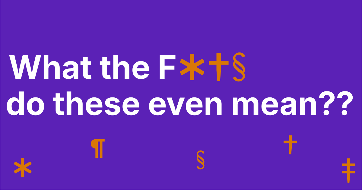
The insurance sector doesn't just use footnotes prolifically. It also reaches for a strange set of visual markers well beyond the common asterisk. Most of us know what an asterisk means. It's the one footnote marker that's made it into common currency. You see it, you know there's small print somewhere. Still far from ideal, but at least it's understood. Insurance pages don't stop there: the dagger, the double dagger, the section sign, the caret. If you're anything like our participants, you've never knowingly seen a double dagger in your life, let alone known it was telling you to go and read the fine print.
They kept surfacing in testing sessions across unrelated projects and unrelated products: participants stopping mid-task, scrolling up and down, losing their place, and eventually giving up on working out what something actually cost. So we went and measured it properly.
The recurring user-research pattern was significant enough to warrant a structured global review: the See Me Please Insurance Footnote Audit 2026.
Across the 53 insurer pages we successfully measured in Australia, the UK, Ireland, the US and the EU, the See Me Please Insurance Footnote Audit 2026 found five different symbols in active use: the asterisk (*), dagger (†), double dagger (‡), caret (^) and section sign (§), plus raised numbers in three different renderings. One Australian home insurance page ran all five symbols at once. Another carried 96 separate markers on a single page.
Overusing footnotes is bad practice on its own, particularly when people are relying on that information to assess value for money. But the problem compounds when footnotes aren't just used prolifically, when a variety of different, unrecognisable visual markers are used as footnote symbols too, on the same page.
Why do insurers keep using footnotes if they create this much friction?
The more interesting answer may be that nobody really owns the decision.
A customer experiences one insurance product. Inside the organisation, that same experience is fragmented across teams. Marketing owns the proposition. Legal owns legal risk. Content owns some of the words. Digital owns the page. Accessibility may sit somewhere else. Product owns the journey, except for the pieces it doesn't.
The organisation chart eventually shows up in the interface. Customers experience one journey; internally, the organisation governs it as a series of separate responsibilities.
Insurance is already hard to buy
You are not buying an object you can inspect. You are buying a promise that only gets tested when something goes wrong, possibly years later. What decides whether it was good value, the premium, the excess, the cover limits, the exclusions, the waiting periods, sits behind almost every footnote on the page.
Here's a snapshot of the problems we found, as common practice across the insurers we reviewed.
Issue 1: Too many footnotes
- The premium is the one number you can see, and it's the one most likely to be footnoted. AXA's home insurance page opens with "from £199." The footnote says 10% of customers paid that or less. So it isn't a price, it's a percentile. You can't use it to compare against anyone else's quote.
- A benefit can shrink to nothing once you read the mark. The same page offers "up to £1,000 emergency cash advance." The footnote says the payment is deducted from your final claim settlement. So it isn't £1,000 of extra value, it's your own money, slightly earlier. That's a real difference when you're weighing one policy against another.
- A promise can turn into a maybe. "Brand new replacements if contents are damaged or stolen" carries a footnote saying repair or cash may be offered instead. "Repairs guaranteed" carries one saying three years for buildings and one year for contents. Both sound absolute in the headline. Neither is, once you read the mark.
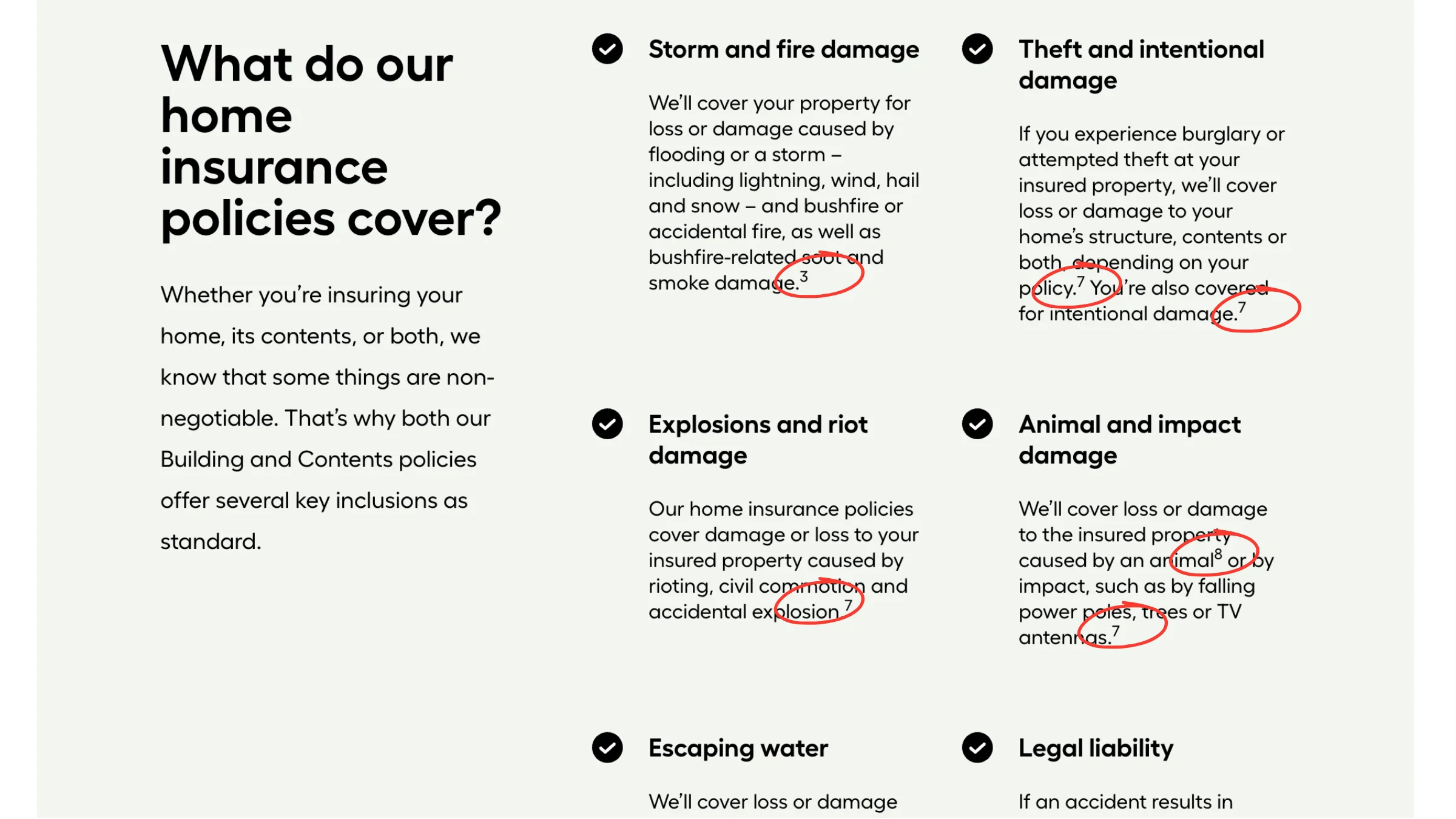
- You can't tell which marks change the price and which are boilerplate. A star next to the premium looks identical to a star next to "terms and conditions apply." One rewrites what you'll pay. One says nothing. Checking them all is the only way to know, and on Youi's home insurance page, that means checking 96 of them.
- The most important information ends up hardest to see. The fine print often matters more to the decision than the headline, yet it sits in the smallest type, furthest down the page. The page is built back to front.
- So people stop checking, and buy on the headline. That's a rational response to a bad deal on your time, but it also means the cheapest-looking policy wins, even when it carries the highest excess and the lowest limits.
Issue 2: Too many different footnote symbols
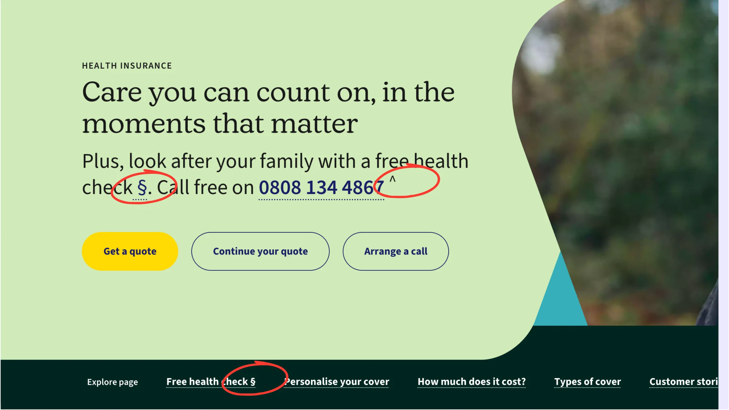
- Missing a mark means missing a cover limit. Most people know a star means small print. Almost nobody knows that about a double dagger or a caret, so those marks get skipped entirely. The qualification is on the page, but it hasn't reached the reader. ahm uses the caret eight times on one health insurance page, and health cover is exactly where waiting periods and exclusions decide everything.
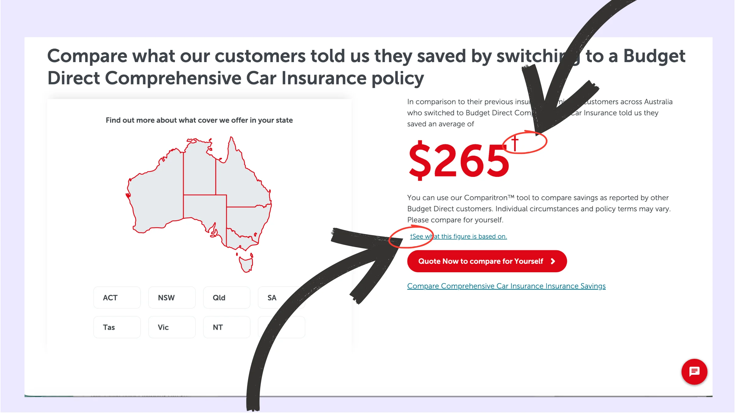
- You can't tell whether two symbols point to one condition or two. Traditional typesetting does have a conventional symbol sequence, but most readers have no reason to know it, and the insurance pages we reviewed did not use the hierarchy consistently enough to make it reliable. Budget Direct runs five different symbols on a single page. Working out whether that's five separate conditions or one condition repeated is guesswork.
- Finding the matching mark is a visual hunt. You're looking for one small symbol among several that look alike, at roughly 10 pixels, often on a phone, usually while trying to hold a figure in your head at the same time.
- Some symbols already mean something else. The section sign (§) means "section" and the pilcrow (¶) means "paragraph" in legal writing, exactly what a real policy clause reference looks like. Using them as footnote markers on an insurance page is confusing even to a reader who knows the convention.
- Unfamiliarity compounds the problem: numbers expose their order, symbols require prior knowledge. 2 obviously comes after 1. Traditional typesetting may sequence * → † → ‡ → § → ‖ → ¶, but that hierarchy is obscure and the insurers we reviewed did not apply it consistently enough to make it dependable. In practice, the symbols do not give the customer a reliable order or unique meaning.
Do footnote symbols like *, †, ‡ and § mean different things?
Here's the part almost nobody knows, including many of the people publishing these pages: the symbols do not carry a unique meaning about the caveat. Traditional print typesetting does have a conventional sequence, * → † → ‡ → § → ‖ → ¶, but that hierarchy is obscure and the insurance pages we reviewed did not consistently honour it.
A dagger does not signal a different kind of caveat from an asterisk. In the context of how footnotes are actually used across insurance websites, the symbols are unreliable position markers rather than meaningful categories. And two of them, § and ¶, already mean something else entirely in legal writing: section and paragraph. On an insurance page, where a real policy clause reference would be entirely plausible, that ambiguity matters.
Key findings
- The See Me Please Insurance Footnote Audit 2026 measured 53 insurer pages across Australia, the United Kingdom, Ireland, the United States and the European Union in mid-2026.
- Australia averages 19.8 footnote markers per product page. The UK averages 7.1.
- One single Australian home insurance page carries 96 footnote markers. That is ninety-six times a reader is asked to stop, scroll, decode a symbol and scroll back.
- The symbols * † ‡ § do not carry unique meaning about the caveat. Traditional typesetting has a conventional sequence, but that hierarchy is obscure and the insurers in our review did not use it consistently. One car insurer runs five different footnote visual markers on a single page.
- Across our standard user research testing of insurance services, participants who were older, spoke English as a second language, or were Deaf, blind, neurodivergent or had low vision described the volume of footnotes as overwhelming. Most did not recognise visual footnote markers other than an asterisk.
- Our broader analysis found a further problem for people who use screen readers: visual footnote markers are frequently not announced at all. A person may therefore read a claim without knowing that a caveat or qualification applies, leaving out information they need to judge value for money.
- No regulatory framework we reviewed requires footnotes. The Australian Securities and Investments Commission (ASIC), the United Kingdom's Financial Conduct Authority (FCA), the National Association of Insurance Commissioners (NAIC) model framework in the United States, and the European Union's (EU) Insurance Product Information Document (IPID) framework all point in the opposite direction: material qualifications should be prominent, close to the claim and legible.
- The strange part is that the industry appears to have standardised a disclosure pattern in the name of compliance that often runs against the communication principles the regulatory frameworks actually prescribe. The footnote is not automatically the compliance. In some circumstances, it may contribute to the prominence problem.
What did the See Me Please Insurance Footnote Audit 2026 find?
Insurance is sold in short, confident sentences. For example: ‘Home insurance from £199. More mental health coverage than anywhere else. Emergency cash advance included’.
Each of those is true in the way a photograph is true, accurate, and cropped.
The crop lives in the footnote. And in most cases the footnote is nowhere near the claim, nothing like the size of the claim, and not connected to the claim in any way a screen reader, a magnifier or a tired human can follow. It is a symbol pointing several screens downward, to a block of grey text under a heading like ‘Important information’.
So we counted. We targeted 62 insurer pages across Australia, the UK, Ireland, the US and the EU, using Playwright driving real Chrome. We measured 53 of them and recorded 9 as unmeasurable rather than pretending they were clean.
We counted in-body reference markers, not the footnotes themselves, but the chases. Every point where a reader is sent somewhere else to find out what the sentence actually meant.
What did the data show?
| Region | Product pages measured | Average markers per page | Heaviest page |
|---|---|---|---|
| Australia | 10 | 19.8 | 96 |
| Ireland | 4 | 7.2 | 12 |
| United Kingdom | 14 | 7.1 | 32 |
| United States | 6 | 6.2 | 20 |
| European Union | 4 | 3.5 | 8 |
Australia is running at roughly three times the UK. We did not expect that going in, and we have no comfortable explanation for it.
Youi's home insurance page is the heaviest page anywhere at 96 markers. The next heaviest are Aviva Health in the UK at 32 and Allianz Australia at 30. So Youi isn't at the top of a gradient. Youi is three times the next worst thing.
The homepage sells. The product page qualifies.
This was the clearest pattern in the data.
Product pages carry 3.6 times the markers of homepages, an average of 9.9 against 2.8. Eight of the thirteen homepages we measured carry no markers at all.
Where we measured the same insurer twice, it holds almost every time:
| Insurer | Homepage | Product page |
|---|---|---|
| AXA UK | 0 | 9 |
| Aviva UK | 0 | 9 |
| Vitality | 7 | 14 |
| Aviva Ireland | 5 | 12 |
Only Medibank reverses it, going 13 down to 2.
And sometimes the qualification is deferred until you download something
Legal & General is the cleanest example. Zero markers on the homepage. Zero on the life insurance page. Seven asterisks in the policy document. Nothing is flagged until you open the PDF and the PDF is the thing almost nobody opens.
Worth noting: 26 of the 37 product pages we measured link no policy document at all. They push you into a quote flow instead.
Aviva Health runs the longest chain we found, 32 markers on the product page, then 17 more in the policy wording.
It is absolutely not inevitable
This is the part we'd want any insurer reading this to sit with.
Zurich UK’s homepage is a genuine zero. We reproduced it repeatedly. Direct Line is zero across its homepage and its product page. So are Legal & General's product page, esure, Halifax, nib and VHI. Five of the fourteen UK product pages we measured are clean.
Same regulators. Same commercial pressure. Same lawyers, more or less. No footnotes.
Two caveats we'd rather say out loud than bury in a footnote.
The Irish figure rests on four measured pages out of eleven targeted, treating it as provisional. The EU figure is one page per market, so it's indicative only. And because superscript formatting doesn't survive PDF text extraction, our PDF counts pick up literal symbols only. A PDF scoring zero is proven free of asterisks and daggers. It is not proven free of footnotes. Those numbers are a floor, not a measurement.
Do the different footnote symbols carry different meanings?
Not different categories of caveat. They do not.
* † ‡ § ‖ ¶ asterisk, dagger, double dagger, section sign, parallels, pilcrow. These are not categories. A dagger does not indicate a different kind of caveat from an asterisk. They are position markers inherited from print typesetting: first, second, third, fourth, fifth, sixth. Run out and you double them **, ††, ‡‡.
Which produces a very specific failure.
Numbers are self-ordering. Symbols only have an order if the reader already knows the old typographic convention, and if the publisher honours it consistently. In the insurance pages we reviewed, that consistency was often absent. Show a reader a † and a ‡ on the same page and the hierarchy is not self-evident.
Budget Direct runs five symbol systems on a single home insurance page * † ‡ ^ §. Five marks, no reliably discoverable order, and no unique meaning attached to the caveat type.
Two of the six are worse than meaningless, because they already mean something else:
- § means section.
- ¶ means paragraph.
Both are standard legal citation marks. Using them as sequence markers on an insurance page where a genuine policy clause reference would be entirely plausible is ambiguous even to a reader who knows the convention perfectly. Budget Direct uses § three times.
Then there's the marker that belongs to no convention at all. The caret ^ isn't part of any footnote system. It survives purely because it's typeable on a standard keyboard. ahm uses it eight times on one page, more than any other page we measured.
And superscript numerals, which look like a sensible fix? They can be worse. More on that in a moment, because that's where the screen reader story starts.
How do insurance footnotes affect people who use screen readers?
This is the section we most wanted to write, because "footnotes are hard to read" is true and useless. The interesting question is hard how, and for whom.
Well, overuse obviously makes it hard for all consumers to digest, but that friction is exacerbated for blind people who rely on screen readers.
Take one real construction from AXA's page: "emergency cash advance with contents insurance³".
The marker gets read as part of the sentence
A <sup>3</sup> is usually just a digit with a bit of styling. There is nothing in the markup saying this is a reference. So the screen reader does what it's told and reads the text.
What comes out of the speakers is: “Emergency cash advance with contents insurance three."
Sit with that for a second. It doesn't sound like a pointer. It sounds like a quantity. Three what? Three advances? Three thousand? A reader who has never seen the page has no way to know a footnote exists at all, they've just been handed a slightly nonsensical sentence and asked to move on.
Nine of the marker systems in this audit are unlabelled superscript numerals.
Or the marker isn't read at all!
Screen readers have punctuation verbosity settings, usually something like none, some, most, all. Most people don't run them at maximum, because at maximum, ordinary prose becomes unbearable.
So how a † or a ‡ gets announced depends on the screen reader, the browser and the individual's settings. It might be spoken by name. It might be described. It might be skipped in complete silence.
That last one is the real problem. If the marker is silent, the qualifier is not hidden, it's invisible. There is no chase to fail at, because there's no signal to chase. The reader is told the coverage is the best available and simply never learns that the sentence had a condition attached.
What happens when every footnote link has the same name?
Here's something people who don't use screen readers rarely know: pulling up a list of all the links on a page is one of the primary ways blind users navigate. You don't read a page top to bottom. You skim it structurally, by heading, by link, by landmark.
Now imagine that list on a page where each footnote marker is a link named *.
Star. Star. Star. Star. Star. Star. Star. Star. Star.
Nine identical entries, none of which tells you where it goes or what it qualifies. If the accessible name is only "*" and the qualifying context is not programmatically determinable, that can fail Web Content Accessibility Guidelines (WCAG) 2.2 Success Criterion (SC) 2.4.4, Link Purpose (In Context). Even where programmatic context technically satisfies the criterion, an extracted list of identical marker links is still poor navigation. The navigation aid becomes noise.
Same story with headings. If you jump through the page by heading looking for the caveats, ‘Important information’ tells you nothing about whether it contains the exclusion that matters to you. The NAIC's model regulation actually anticipated this decades ago. More on that below.
Often the link isn't a link at all
Where a marker and its qualifier are connected only by visual convention, the symbol looks like it matches the symbol at the bottom, but that relationship doesn't exist in the code. It is a presentational illusion that works for sighted readers and simply isn't there for anyone else.
That's SC 1.3.1, Info and Relationships. And it means the reader's only option is to read the entire footnote block and try to reverse-engineer which note belongs to which claim.
And then you have to get back
Say everything works. The marker is announced; it's a real link, you follow it.
You are now at the bottom of a long page. If there's no return link, your reading position is gone. Not "a bit awkward" - gone. You have to navigate back up and re-find the exact sentence you left, in a page you can't see the shape of.
Do that once and it's an irritation. Do it 96 times and you close the tab.
Where it's done properly, it shows, and I want to give credit: AXA's markers carry accessible labels reading "Go to footnote 1", and Aviva's footnote block provides "Back to footnote" return links. That is the whole fix. It isn't expensive. It's just usually not done.
Who else is affected by insurance footnotes?
The footnote is unusual in that it fails almost every cohort we test with, for a different reason each time.
- Low vision, using magnification. At 400% zoom, only a fragment of the page is on screen. The marker is around 10px. The note is 800px away. The two things you need to compare can never be in view at the same time - which is the entire task. You're being asked to hold a claim in your head, travel, and come back, with no way to check you've matched the right symbol.
- Older adults. Superscript renders at roughly 60–70% of body size. On 16px body text, that's a marker of about 10px. The element carrying the most consequential information on the page is also the smallest thing on it. Add presbyopia and it is functionally not there.
- Neurodivergent readers, and anyone with a working memory difference. Every marker asks you to hold a claim in working memory, break off mid-sentence, travel, search a list of similar symbols, read, and return to an exact point. That's a cross-reference task stacked on top of a comprehension task, in a subject most people already find hard. Youi's page makes that request 96 times.
- Readers in a second language. The dagger convention is a Western print tradition. It is not universal, it is not taught, and it is not guessable. If you don't already know that ‡ means "third note", nothing on the page tells you.
- Anyone using voice control. Try dictating a command to activate a superscript asterisk. There's no reliable name to say.
- Anyone using a touchscreen - which is most people. WCAG 2.2 SC 2.5.8 sets a 24×24 CSS-pixel minimum for pointer targets at Level AA, but it explicitly exempts inline targets in sentences or where line-height constrains the target. So a tiny superscript footnote link is not automatically a WCAG 2.5.8 failure. It can still be a terrible touch target. This one isn't only a disability issue. It's a thumbs issue.
Notice what's happened there. Six cohorts, six different mechanisms, one design pattern. That's rare, and it's why we think this is worth naming rather than filing as a minor typography gripe.
‘The plainest way to say all of it: if the qualifier changes the decision, and the reader can't reliably reach the qualifier, the reader can't make an informed decision. Informed choice is the entire reason the disclosure requirement exists.’
Interestingly, there is no WCAG success criterion at Level AA that catches the full working-memory cost of this pattern. You can create material friction for every reader in that list and still pass a conformance audit. Accessibility conformance reports and the consultants who conduct them serve an important purpose, and deep domain expertise in accessibility should be respected. WCAG catches many barriers that teams would otherwise miss. The limitation is scope. A conformance audit asks whether defined success criteria are met; it does not necessarily answer whether a customer with different cognitive, visual, linguistic and assistive-technology needs can understand and use the product end to end. The risk comes when an organisation treats "passed accessibility review" as a proxy for universal usability. We have no doubt insurers want to do the right thing. The objective is simply broader than the control.
Do insurance regulators require footnotes?
Some might assume that regulators ask for footnotes. They don't. We dug deep to better understand what each jurisdiction requires of insurers when selling insurance. The regulatory frameworks differ, but the communication principle is remarkably consistent.
Across the frameworks we reviewed, three principles keep recurring:
- Disclose the material qualification - exclusions, limits, waiting periods, reductions.
- Make it prominent, in proportion to the claim it's qualifying.
- Don't mislead on overall impression - judged on how a reasonable person reads the page first, not after cross-referencing.
None of that is a format instruction. "Superscript symbol, text at the bottom" is a convention the industry chose. In fact, regulation intentionally tries to ensure insurance companies make their policy inclusions clear, transparent and easy to understand. Footnotes - particularly the prolific use and combinations of random symbols that are widely adopted and that no one understands, do the opposite.
Australia - Australian Securities and Investments Commission (ASIC) Regulatory Guide 234
Qualifications of a headline claim must be clear and prominent, and the more work the qualification is doing to balance the headline, the more prominent it has to be. Warnings should appear in similar form to the main body and generally not in fine print at the bottom.
And the line that matters most: a disclaimer cannot rescue a headline that is misleading on its own.
ASIC issued the revised Regulatory Guide 234 on 9 June 2026. The current guide continues to focus on avoiding misleading overall impressions and on giving warnings, disclaimers and qualifications sufficient prominence.
United States - National Association of Insurance Commissioners (NAIC) Model Regulation 40
This is a model regulation, not a single nationwide federal rule. US insurance regulation is state-based, and NAIC models are adopted or adapted by states. As a model framework, Regulation 40 is the most explicit of the four we reviewed by some distance.
Required disclosures must be set out conspicuously and in close conjunction to the statements to which the information relates, or under prominent captions - and must not be minimised, rendered obscure, or intermingled with surrounding text.
It goes further. It names the permitted captions - Exceptions, Exclusions, Conditions Not Covered - and explicitly prohibits vague ones like Extent of Coverage, on the grounds that they fail to signal significance. "Prominently" is defined as noticeably set apart. There's even a drafting note saying that if an advertisement is so long it obscures the disclosure, the format itself has to change.
Read that plainly against a † pointing 800 pixels down the page. That is neither close conjunction nor noticeably set apart.
United Kingdom - Financial Conduct Authority (FCA)
The FCA's Insurance Conduct of Business Sourcebook (ICOBS) 2.2 requires communications to be clear, fair and not misleading.
PRIN 2A.5 - the Consumer Duty's consumer understanding outcome - gives unusually direct support to this point. FCA guidance says firms should present information logically, use plain and intelligible language, explain unavoidable jargon, make key information prominent through headings, layout and presentation, avoid unnecessary disclaimers, and avoid providing so much information that it prevents customers from making effective decisions. That instruction to avoid unnecessary disclaimers is difficult to square with a page that requires customers to decode dozens of footnote markers.
The direction becomes even clearer for pricing claims. From 31 July 2026, ICOBS guidance says the basis for claimed benefits and any significant limitations should be stated prominently.
European Union and Ireland - Insurance Distribution Directive (IDD) and Insurance Product Information Document (IPID)
This is the one place where format genuinely is prescribed. And it still isn't footnotes.
The Insurance Product Information Document (IDD Article 20, Implementing Regulation 2017/1469) mandates sections, headings, sequence, layout and a minimum x-height of 1.2mm. The PRIIPs Key Information Document works the same way.
So regulators do write presentation rules when they care enough. And what they write is a standardised short document with prescribed headings, a fixed order, and a font-size floor.
That is the exact opposite design philosophy to symbol-indexed footnotes.
Put the four side by side
They point, independently and without coordinating, at the same conclusion:
A material qualification belongs inline with the claim, or under a plainly-captioned heading, in a legible size.
Which means the footnote isn't the compliance. It's arguably the breach - a prominence failure wearing the costume of diligence.
We'll be careful here, because we’re not lawyers and whether any individual page crosses the line is a legal question about that page. But the pattern is running in the opposite direction to what all four regulatory frameworks ask for, and "everyone does it" has never been a defence that ages well.
Why do insurers keep using footnotes if they create this much friction?
Three explanations survive contact with the evidence. None of them is compliance.
Evidentiary defensibility. In a dispute, "it was disclosed" is far easier to prove than "it was understood." Some may hold the view that footnotes optimise for the litigation record to protect the customer. We’ll let you judge if they serve the consumer reading the website copy.
Print heritage. The pattern came off paper policy schedules and newspaper advertisements, where space was genuinely, physically constrained. It got carried onto the web unexamined where space is free and scrolling is not.
The org chart leaks into the customer experience. Legal owns legal risk. Marketing owns the headline. Content owns some of the words. Digital owns the page. Accessibility may sit somewhere else entirely. Each team can do its own job correctly while nobody owns whether the whole thing makes sense end to end. The customer experiences one product and one journey; internally, the organisation experiences a series of separate workstreams, approvals and risk owners. That fragmentation eventually shows up in the interface.
Legal risk has an obvious owner. UX risk often doesn't. Legal teams are explicitly accountable for ensuring important qualifications exist and organisational risk is controlled. Who is equally empowered and accountable for what happens if the qualification is technically present but practically incomprehensible? One risk has governance, escalation paths and executive weight. The other is often treated as a design preference. That creates a predictable asymmetry: teams are rewarded for making sure information exists, while far fewer organisations give someone equivalent authority to ensure the customer can actually use it.
The easiest internal compromise is additive, not corrective. Marketing writes the attractive claim. Legal doesn't necessarily rewrite it; it adds the qualification. Nobody wants to reopen approved copy, challenge the proposition or start another approval cycle, so the caveat gets bolted on. Nobody rewrites the headline. One caveat looks harmless. Repeated across a page, those additions accumulate into disclosure debt: information keeps being added to protect the organisation, while the customer's job of understanding the product becomes progressively harder.
Accessibility governance can accidentally reinforce the problem when conformance becomes the endpoint rather than one important control. This is not a criticism of accessibility specialists or WCAG audits. Their deep technical expertise serves a real purpose, and conformance work catches barriers that matter. But a WCAG audit asks whether specific success criteria are met. It does not necessarily ask the larger question: Can a real person understand this insurance product well enough to make an informed decision? An organisation can remediate the listed failures and still leave a dominant universal-usability problem untouched.
Passing an audit becomes a proxy for the actual objective. This is a classic governance problem: the measurable control gradually substitutes for the outcome it was created to protect. “Has it passed accessibility review?” is straightforward. “Can customers with very different cognitive, visual, linguistic and assistive-technology needs actually use it?” is much harder. Once the proxy becomes the target, teams stop looking between the criteria.
Templates institutionalise yesterday's decisions. Once footnotes are built into a CMS component, content template, design system or legal-review workflow, using them becomes the path of least resistance. A new product team isn't deciding that a dagger is good communication; they're selecting the approved “disclaimer” component that already exists.
That's why the pattern survives audit after audit. It isn't a decision anyone defends. It's a decision nobody makes.
When disclosure records information without reliably communicating it

Insurance has created a disclosure mechanism that can technically record information without reliably communicating it. A qualification can be present, and therefore defensible internally, while still failing to reach the reader in a form they can use. A price or a superlative is stated plainly and prominently. The condition that limits it is set in the smallest type on the page, at the furthest point from the claim, behind a mark that carries no unique meaning and may not be announced at all.
AXA: "Home insurance from £199." The qualifier, at the foot of the page, reads: "10% of AXA Plus Home Insurance customers paid this or less." The headline figure is the cheapest decile.
Neither is hidden. Both are, in the strict sense, disclosed.
And that's the question the See Me Please Insurance Footnote Audit 2026 exists to ask: is disclosure delivered this way disclosure a reader can actually use?
There's one more finding that answers the "everyone does it" defence rather neatly.
ahm and Medibank are the same company - ahm is Medibank's lower-cost brand. Medibank's product page carries 2 markers. ahm's carries 14. One owner, one market, one regulator, and seven times the load depending on which brand you happen to land on.
In the UK, Aviva now owns Direct Line following its £3.7bn acquisition in July 2025. Aviva's pages carry markers. Direct Line's carry none - homepage, product page and policy booklet.
Same group. Same rules. Opposite conventions.
Which tells you this was never compliance. It was habit.
What should insurers do instead?
Four things, none of them expensive:
1. Put the material qualification next to the claim. If the price is a tenth-percentile figure, that belongs in the sentence stating the price. Not 800 pixels below it. Yes, this means rewriting the headline. That's the job.
2. If a note is genuinely necessary, use numbers. Numbers are self-ordering. Never mix systems. Never use ^, § or ¶.
3. Make the relationship real in the markup. A programmatic link in both directions, an accessible name that says "Go to footnote 1" rather than "1", and a return link so the reader doesn't lose their place. Where design allows, give the marker a comfortably tappable target or sufficient spacing rather than treating WCAG 2.5.8's inline exception as a usability target.
4. Caption the block plainly. Exclusions. What isn't covered. Not Important information - and definitely not Extent of Coverage, which the NAIC model specifically prohibits.
And one test that catches most of it, which costs nothing:
Read the page once, top to bottom, without following a single marker. If the impression you're left with is more generous than the product, the footnotes aren't disclosure. They're decoration on a claim that needs rewriting.
Regulation doesn't predict it, habit does.
FAQs
Is it illegal for insurers to use footnotes?
Not directly. None of the regulatory frameworks we checked bans footnotes outright. But all four frameworks emphasise prominence, clarity, proximity or overall impression in ways that cut against burying a material qualification behind an obscure marker. A symbol pointing to text 800 pixels down the page is hard to reconcile with "prominent" or "close in conjunction" - which is why we frame the pattern as a likely prominence failure, not a settled legal breach. We're not lawyers, and whether any individual page crosses the line is a legal question about that specific page.
Isn't this just an accessibility issue?
No - that's the point. It fails screen reader users, but it also fails low-vision readers using magnification, older readers (the marker renders at ~60–70% of body text size), anyone with a working-memory difference, second-language readers who don't know the dagger convention, voice-control users, and touchscreen users trying to tap tiny superscript targets, even where WCAG's inline-target exception may technically apply. Eight different reader types, eight different failure mechanisms, one design pattern.
Why do insurers keep doing this if it doesn't work?
Three reasons survive contact with the evidence, and none of them is compliance: "it was disclosed" is easier to prove in a dispute than "it was understood"; the convention came off paper policy schedules where space was genuinely limited and got carried onto the web unexamined; and legal review typically appends caveats to finished marketing copy rather than rewriting the headline. Nobody rewrites the headline.
Do the different symbols (*, †, ‡, §) mean different things?
Not in the way a customer would reasonably expect. Traditional typesetting has a conventional sequence, but the symbols are not categories of caveat, the hierarchy is obscure, and insurers in our review did not apply it consistently enough to make it reliable. Two of them, § and ¶, already mean something else in legal writing (section and paragraph), which makes their reuse as footnote markers especially ambiguous on a page that might also cite an actual policy clause.
Is this an Australia-specific problem?
Australia is the heaviest market we measured - averaging roughly three times the UK's rate - but the pattern shows up everywhere we looked, and it's not universal even within a market. ahm and Medibank are the same company, yet ahm's page carries seven times the markers Medibank's does. Direct Line (zero markers) and its parent Aviva (which carries markers) is the same story in the UK.
What should an insurer do instead?
Put the qualification next to the claim rather than deferring it. If a marker is genuinely needed, use numbers because their order is self-evident, and never mix symbol systems. Make the marker-to-note relationship real in the code - a programmatic link, an accessible name like "Go to footnote 1," and a return link. And caption the footnote block plainly ("Exclusions," not "Important information").
Does having no footnotes mean a page is fully accessible?
Not necessarily - a zero on our count means the page carried no reference markers, not that it passed a full accessibility review. It's one specific, common failure pattern we chose to measure because it's so prevalent and so rarely questioned, not a stand-in for compliance overall.
Methodology
Scope and sample
The See Me Please Insurance Footnote Audit 2026 was conducted in mid-2026 as a point-in-time review of insurance websites across Australia, the United Kingdom, Ireland, the United States and the European Union. We targeted 62 pages and successfully measured 53. Nine were recorded as unmeasurable rather than assumed to be clean. The sample included consumer homepages, product overview pages and underlying policy documents where they were available.
What we counted
We used Playwright driving real Chrome to count in-body reference markers: the points where a reader is sent elsewhere to understand what a sentence actually means. These included superscript numerals, literal symbols such as *, †, ‡, ^ and §, and bracketed numerals. We counted the markers, not simply the number of notes at the bottom of the page.
How the audit relates to our user research
The automated audit was prompted by recurring patterns first observed in See Me Please user testing across insurance services. The participant findings cited in this article are qualitative user-research observations and are not the same dataset as the automated page counts. The two evidence sources are used together: observed behaviour identified the pattern, then the audit measured how widely the pattern appeared across the reviewed pages.
Limitations
This is a snapshot, not a permanent scorecard. Insurer websites, prices and disclosure patterns change. PDF counts are also a floor rather than a complete measurement because superscript formatting may not survive text extraction; a PDF with no literal asterisks or daggers is not necessarily free of footnotes. The Irish result is based on four measured pages out of eleven targeted and should be treated as provisional. The European Union figure is based on one page per market and is indicative only.
Primary sources
Australian Securities and Investments Commission (ASIC), Regulatory Guide 234
Financial Conduct Authority (FCA), ICOBS 2.2
Financial Conduct Authority (FCA), PRIN 2A.5 Consumer Duty
National Association of Insurance Commissioners (NAIC), Model Regulation 40
European Union, Insurance Product Information Document Implementing Regulation 2017
W3C Web Content Accessibility Guidelines (WCAG) 2.2, SC 1.3.1 Info and Relationships