There's a long-running confusion in accessibility teams about what each kind of testing actually does. It's often framed as a choice, axe or real users, Lighthouse or qualitative research, automated scans or panel testing. That framing is wrong. The two methods don't compete; they answer different questions, find different defects, and produce different evidence. If you treat them as alternatives, you'll buy the cheaper one and then be surprised by what shipped.
Here's what each actually does, what each misses, and how to decide where to put your budget.
What automated accessibility testing actually catches
Tools like axe, WAVE, Lighthouse, Pa11y, and SiteImprove are static analyzers. They parse your DOM, run a series of programmatic checks, and report violations against a rule set, most commonly WCAG 2.1 or 2.2.
Let's say the kind thing first, because it's true: automated accessibility testing has a lot going for it. It's cheap. It's fast. It runs on every PR with zero human time, scales to any codebase, and never has a bad day. At See Me Please we use these tools ourselves during product development. They're an essential part of any responsible engineering workflow, not just for accessibility but for catching regressions before they ship. If you're building a digital product without an automated accessibility check in your CI pipeline, you're shipping known defects. Full stop.
The strengths are real and worth respecting:
Missing alt text on images
Missing form labels and ARIA roles
Insufficient colour contrast in measurable text
Heading order violations (e.g. an
h4with noh3above it)Empty links and buttons
Missing language attributes
Broken keyboard focus order (some tools, not all)
These are real defects. They should never reach production. A good CI pipeline runs axe (or equivalent) against every PR and fails the build on regressions. That's table stakes.
What automated tools won't do, and this is the part most teams underestimate, is catch the issues that determine whether a real person can use your product. By Deque's own published figures, automated tools catch around 30–50% of WCAG violations. The remaining 50–70% need a human, and they're the ones that drive your customers away.
What automated testing structurally cannot catch
The category of accessibility failure that automated tools cannot see is anything that depends on context, comprehension, or lived experience. Some concrete examples:
Whether an alt-text string is actually descriptive. A tool can confirm
alt="image"exists; it can't tell you the alt is useless. A screen reader user can tell you in 30 seconds.Whether button and link labels are actually distinguishable in context. A scanner confirms each button has a visible name. It doesn't tell you the form has five separate "Edit" buttons at the bottom (Edit Profile, Edit Address, Edit Payment, Edit Preferences, Edit Notifications) that all expose to a screen reader as just "Edit, button. Edit, button. Edit, button." Five times. Every label passes individually. The page is unusable.
Whether the content is itself readable. Scanners look at the markup; they don't look at the prose. A government services page can pass every WCAG rule and still be impenetrable to anyone without a postgraduate education in policy language. Plain-language audits, sentence-length checks, and service-design readability are entire disciplines that automated accessibility tools don't touch.
Whether a tab order is logical. Tools confirm the order exists; humans confirm whether the order matches the visual reading order or jumps around the page in nonsense ways.
Whether the page is full of obstructive "invisible" elements. This is one we observe constantly, and it causes outsized friction. Modern web apps accumulate dozens of empty containers, off-screen tracking pixels, abandoned dropdown wrappers, accidental focusable
<div>s, and stale utility components that are invisible to sighted users but very much real to anyone navigating with a keyboard or screen reader. An automated tool assumes every element in the DOM is there deliberately. A blind tester ends up tabbing through 20 hidden elements to reach what should be the next visible interactive control. The page passes every automated check (every element has valid markup, valid roles, valid focus behaviour) while the experience is quietly eroded to the point of unusable. You only find this by watching a real screen reader user attempt to navigate the page.Whether form errors are understandable. "Field invalid" passes contrast checks. It doesn't pass comprehension checks for users with cognitive load constraints or English as a second language.
Whether the underlying language is plain. WCAG 3.1.5 (Reading Level) is AAA; most teams skip it. But ESL users abandon insurance product disclosure statements daily because the language is dense, not because the contrast is wrong.
Whether the experience is actually accessible end-to-end. A login flow might pass every page-level scan and still lock out users at the second-factor code step because the OTP is buried in a paragraph that's hard to find at high zoom.
Whether character distinction is reliable. Atkinson Hyperlegible exists because Times New Roman and Helvetica fail real low-vision users on
l/I/1andO/0confusion. No automated tool flags this, the characters are technically distinct in the font file.Whether the user can actually complete the task. This is the only outcome that matters commercially, and it's the one no static analyzer can measure.
The "five Edit buttons" example is the one we keep coming back to because it captures the limit perfectly. The scanner has done its job, every button has a name. A real screen reader user gets to the end of a form, hears five identical labels, and has no idea which one to press. That gap between labelled and usable is the entire reason real-user testing exists.
What accessibility user testing with disabled users catches that nothing else does
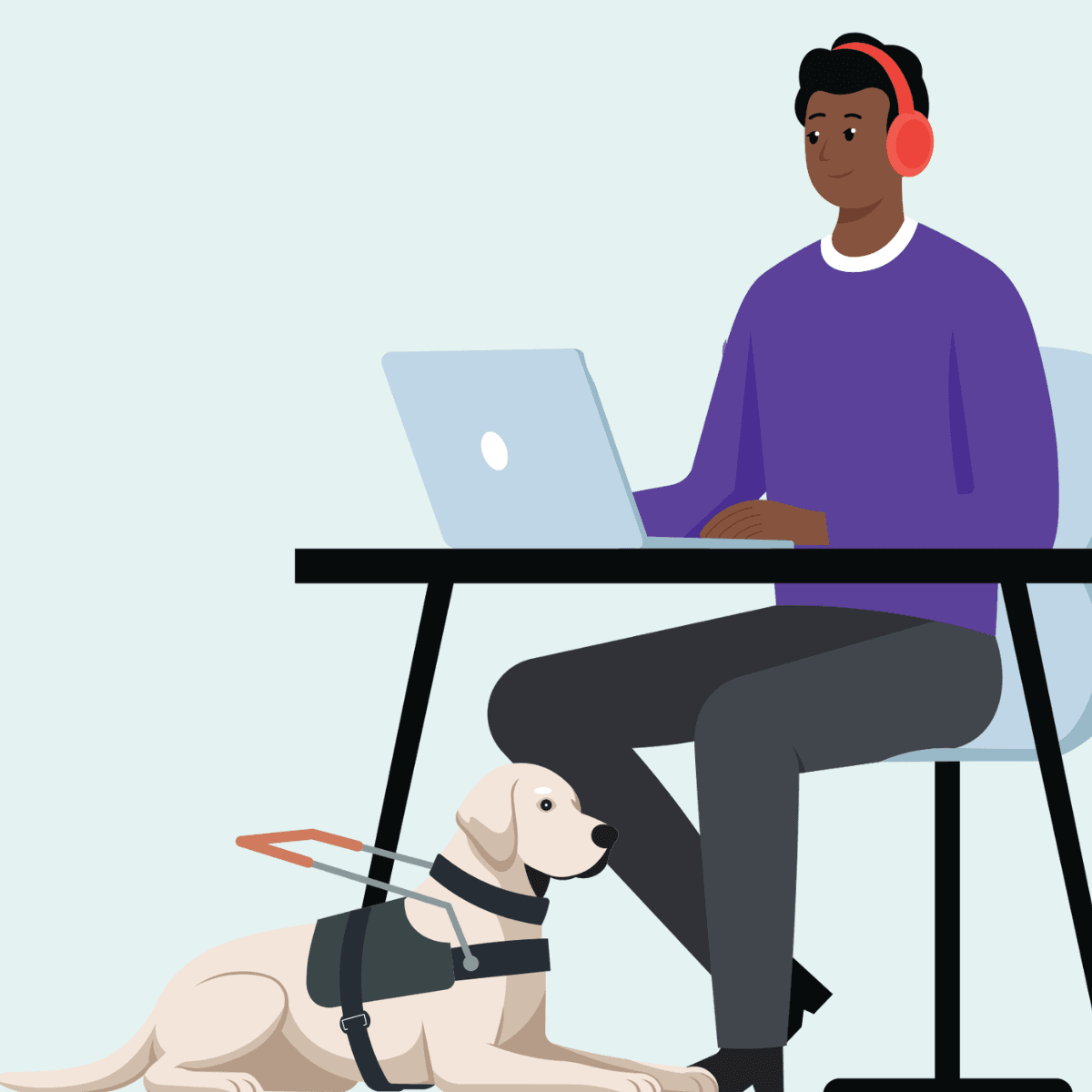
Real-user testing means watching a disabled participant attempt your product on their own assistive technology, in their own environment, completing real tasks. It produces evidence that no other method produces:
The actual point of abandonment: not the page that fails an audit, but the page where users give up
The cognitive load of the experience: the gap between "technically possible" and "tolerable for a 9-minute session"
The workarounds users have built: the screen reader user who fills out forms backwards because labels are misordered; the older user who screenshots OTPs because they can't read them in time
The features that matter most: across hundreds of See Me Please projects, dark mode consistently ranks higher than embedded read-aloud or text-resize widgets that most accessibility budgets prioritise
The verbatim feedback: the quote that ends up in the executive summary because it crystallises the issue better than any heatmap
The findings sit at a different layer of fidelity. An automated tool says "low contrast on .error-text." A real-user finding says "Daniel abandoned the password recovery flow at step three because the verification code was rendered in a 12px italic serif on a beige background, and he didn't realise it was a code until his support call." Both are true. Only one drives a fix that actually changes the outcome.
Where each method belongs in your delivery cycle
Pre-merge CI — Use automated: ✅ Required on every PR; Use real-user: ❌ Too slow
Pre-release smoke test — Use automated: ✅ Run a full-site scan; Use real-user: ❌ Too slow
Design validation — Use automated: ❌ Designs aren't running yet; Use real-user: ✅ Co-design with cohorts during prototype phase
Pre-launch confidence check — Use automated: ✅ Surface obvious regressions; Use real-user: ✅ Catch what audits miss
Post-launch monitoring — Use automated: ✅ Detect rule violations introduced over time; Use real-user: ✅ Periodic panel re-testing for friction trends
Procurement / vendor evaluation — Use automated: ❌ Vendor will lie or remediate; Use real-user: ✅ Test against your own diverse panel
The honest read: automated belongs in the build pipeline and runs continuously; real-user belongs at the moments where shipping decisions get made.
"But our budget is limited, which one wins?"
If you genuinely can only afford one, the question becomes: which one finds defects your team isn't already finding?
If your team is new to accessibility and your CI pipeline doesn't run axe on every PR, start with automated. You're shipping known violations and a free tool will surface them.
If your team is already running automated tools, has been for a year, has remediated the obvious issues, and is now seeing a long tail of complaints from real users that the scanner says nothing about, real-user is where the next ten points of usability come from. The friction your customers report and the issues your scanner flags are now in different categories. Adding more scanner coverage won't move the needle. Real participants will.
There's also a hard-headed commercial point worth saying out loud. A failed audit is a delayed launch and a remediation invoice. A failed user is a churned customer and a brand reputation hit. The cost ratio between the two is not subtle. Most accessibility budgets are set as if it were.
What SMP does with the gap
Every See Me Please project is built around a panel of 18 diverse and disabled participants: three each from six cohorts. We watch them attempt real tasks on real production (or pre-production) surfaces, classify every friction observation by type and severity, and score the experience on a paired accessibility-and-usability scale. We don't replace your automated tooling. We replace the conversation that begins with "the audit passed but customers are complaining."
If your team's current accessibility budget is 100% automated scanning, you're catching half the defects. The other half are walking out your funnel.
See Me Please is a diverse and disabled user testing platform connecting organisations with diverse and disabled participants to evaluate real-world usability beyond WCAG compliance.