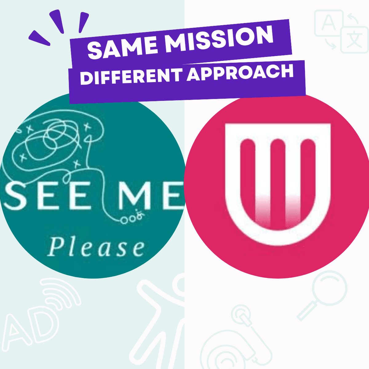
If you've been looking for a platform that connects your team with disabled users for testing, the two names you've probably come across are See Me Please and Fable. Both are real, both are good at what they do, and both exist because automated accessibility tools alone can't tell you whether a product is actually usable. But they're not the same product. They run different panels, they measure different things, and they suit different jobs.
This article lays out the difference plainly, not as a sales pitch, but so you can pick the platform that matches the work in front of you.
What both do
Both See Me Please and Fable recruit disabled users to test your digital products and feed the findings back to your team. Both are alternatives to the older models of "send a screen reader user a Calendly invite once a year and hope for insight." Both treat lived experience as the primary source of signal, not assumed personas or static audit reports.
If you already buy into the idea that you can't test accessibility without disabled testers, you've narrowed your choice down to two reasonable options. The differences below decide which one fits your team.
The big difference: who's on the panel
Fable, in its own words, is "the only accessibility platform powered by people with disabilities." The panel is built around assistive technology users: screen reader users, switch users, magnification users, and so on. If your work is about getting AT compatibility right, Fable is squarely aimed at you.
See Me Please runs a broader, structured panel. Every project we run draws from six core cohorts:
Blind users (screen reader users)
Low vision users
Neurodivergent users
Deaf and Hard of Hearing users
Older users (typically over 70)
People who speak English as a second language
And just as importantly, we don't stop there. The six cohorts are the floor, not the ceiling. We routinely include additional perspectives depending on the project: head mouse users, switch users, mouth stick users, voice-control users, users with limited dexterity, users with intermittent or progressive conditions, and any other cohort whose experience surfaces friction the standard six wouldn't catch. The principle is simple: if a perspective experiences accessibility friction in the real world, it belongs in the panel. We don't lock our testing down to a fixed template; we shape it around the surfaces and the users that matter for the project in front of us.
We deliberately include cohorts that don't always use assistive technology, and cohorts whose AT isn't a screen reader. Older users, ESL users, and many neurodivergent users navigate the same product surfaces as everyone else, but they hit different friction. Head mouse and switch users will surface focus-order and click-target issues that no other cohort exposes. All of them are commercially significant users for banking, government, healthcare, and insurance services, and most accessibility platforms don't structurally include them.
This is the single biggest difference between the two platforms. If your product serves the general public (citizens, customers, patients, parents), you're testing for more than AT compatibility. You're testing for universal usability. See Me Please is built around that wider remit.
Where the biggest barriers actually live
There's a misconception baked deep into most accessibility programmes. When designers, developers, and researchers hear "accessibility", the mental picture is almost always a blind user with a screen reader, or a wheelchair user navigating a physical space. That picture matters and those users matter. But it's incomplete in a way that costs real customers and real revenue.
In project after project, the cohorts who hit the biggest barriers aren't always the ones the team has in mind:
Older users struggling with authentication flows that assume perfect motor precision and 20/20 vision
Neurodivergent users abandoning checkouts where the cognitive load (autoplay video, animated banners, time-pressured CTAs) makes the task impossible to complete
ESL users failing at comprehension steps where a single dense sentence written in policy dialect blocks the whole journey
None of these participants use a screen reader. None of them appear in the persona deck under "accessibility users". All of them are paying customers (or citizens accessing essential services) right now, and all of them are abandoning at rates the analytics team labels as "general drop-off".
The pattern that surfaces repeatedly in our testing, and that's worth understanding if you're choosing between an AT-only platform and a broader-cohort platform, is this: a significant proportion of the friction we find affects participants across multiple cohorts simultaneously. The same vague error message that confuses an ESL user also confuses a neurodivergent user. The same poorly signposted CTA that frustrates an older user also frustrates a low-vision user at high zoom. The same convoluted service-design step that blocks a screen reader user also blocks a sighted user in a hurry.
When the same severe friction shows up in three cohorts out of six, it's not three accessibility issues. It's one universal usability issue with three faces.
This is what testing across a broader, structured panel reveals that AT-only testing can't. The convergent evidence (multiple cohorts hitting the same blocker for different reasons) tells the product team that the fix isn't a niche accommodation. It's a fundamental clarity problem that, once fixed, makes the experience better for everyone, including the silent majority of users without a declared disability who were also struggling but didn't tell you.
That's where the highest-leverage accessibility investment lives. And it's only visible if you're testing across cohorts.
How findings get scored
Both platforms generate research outputs. The shape of those outputs differs.
Fable offers the Accessible Usability Scale (AUS), a free measurement tool adapted from the well-known System Usability Scale. It's a useful, lightweight benchmark.
See Me Please scores every project on two separate streams:
An accessibility score, derived from objective transcript evidence, can the participant get to the information they need to make an informed decision?
A usability score, derived from a combination of survey sentiment and observed friction, is it seamless, intuitive, and respectful of the participant's time?
Each score lands in one of four bands (Awesome / Nice / Hmm / Ouch) at both the task level and the project level. Behind the scores sit seven classified friction types and six severity levels, applied consistently across projects so you can benchmark and compare. The full methodology is published at /knowledge/accessibility-v-usability (opens in a new tab).
The reason for keeping accessibility and usability as separate streams is editorial: a product can be accessible (the information is reachable) but unusable (the experience is exhausting), or vice versa. Compressing both into one number hides the part of the result that determines what to fix.
How the platforms position themselves
A genuine note first, because being a kind competitor matters. Fable have been at this work for a long time, and they've done a great deal to legitimise the entire category of disability-led research, work that benefits every platform in this space, including ours. Their depth on assistive-technology testing is real and hard-won. The Accessible Usability Scale they publish is a free, open contribution to the field that anyone (including us) can use as a benchmark. If your work sits primarily in AT compatibility, you're in good company with them.
See Me Please sits in a complementary place. We position ourselves as the layer that catches what WCAG (and AT-focused testing) can't see: the universal usability issues that show up across cohorts, the convergent friction patterns that affect older users, ESL users, and neurodivergent users alongside AT users. Compliance is a starting point. Whether a service is usable, dignified, and efficient for the people who depend on it is a different question, and that's the question we answer. Our footer signature on every published article is deliberate: "connecting organisations with diverse and disabled participants to evaluate real-world usability beyond WCAG compliance."
Both stances have a place. Some organisations need both, and that's a legitimate procurement choice, not an either/or.
How participants get paid: a hard differentiator most teams don't ask about
Both platforms recruit disabled users. The question worth asking is how those users are treated as professionals. This is where the difference between accessibility testing and accessibility extraction becomes uncomfortably visible across the industry.
See Me Please's floor is double the open-employment minimum wage of the region we're testing in. Many of our seasoned testers are paid materially more than that. We don't run rates downward to win procurement bake-offs. The people testing your product are doing skilled work, and they're paid accordingly.
We also enforce a minimum three hours of paid time per testing engagement, regardless of whether the session itself runs shorter. The reason is the gig economy. A 45-minute session at a low rate, with no booking floor, treats participants as on-demand labour rather than research professionals. For someone navigating the world with a disability, the cost of showing up (coordinating transport, assistive tech, mental preparation, post-session fatigue) is the same regardless of session length. A three-hour minimum acknowledges that cost honestly.
If you're evaluating accessibility research platforms, ask:
What's the floor pay rate per session? Anything at or below local minimum wage is extractive.
Is there a session-length minimum, or are participants paid only for the time on the call?
Are participants treated as employees, contractors, or panel members? Each has different protections.
How are no-shows from the client side handled? Participants should be paid regardless.
This isn't peripheral to the work. The quality of insight you get is downstream of whether the participants feel respected, prepared, and not rushed. Cheap participant rates produce cheap insight. We've watched it happen across the industry, and it's a reason we set the floor where we did.
Engagement model: no monthly lock-in
This one matters more than it sounds. A lot of accessibility research platforms operate on a SaaS-style subscription where the customer commits to a fixed number of tests per month (or year), regardless of whether their product roadmap actually has something worth testing in that window.
We don't do that. There's no monthly minimum, no obligation to keep the panel busy with low-value tests just because the contract says so, and no penalty for going dark for a release cycle. Customers engage See Me Please when they've got something real to test: a redesign in flight, a new flow in pre-launch, an audit-flagged issue to validate the fix on, a quarterly review of a critical journey. The cadence follows your product, not our billing schedule.
This is deliberately at odds with the prevailing SaaS instinct of locking in recurring revenue. We chose it because we kept watching teams burn their testing budget on low-stakes surfaces in slow months just to "use up" the contract, then arrive at a major launch without budget left for the panel that mattered. That's the opposite of how research budgets should work. Test where the stakes are, scale up when you need depth, and don't pay for testing you don't need.
If you're evaluating accessibility research platforms, ask whether the engagement is project-based or subscription-based, and what happens to unused test capacity in a quiet month. The answer tells you whether the platform's incentives are aligned with your product's actual research needs, or with their book-rate forecast.
When each accessibility user testing platform makes most sense
Pick Fable when… Your primary risk is AT incompatibility. Pick See Me Please when… Your product serves the general public.
Pick Fable when… You're benchmarking via AUS. Pick See Me Please when… You want paired accessibility + usability scores.
Pick Fable when… Your researchers want a self-serve recruitment pool. Pick See Me Please when… You want a managed end-to-end testing engagement with classified friction across six core cohorts (plus the additional perspectives a project warrants).
Pick Fable when… You prefer a steady monthly testing cadence. Pick See Me Please when… You want project-based engagement that scales with your roadmap.
Pick Fable when… You're looking for AT-specific findings. Pick See Me Please when… You're looking for universal usability findings that surface convergent friction across cohorts.
What we'd recommend asking either platform before you commit
The platform-comparison questions worth asking, of us, of Fable, or of any other accessibility research vendor:
Who's on the panel? Ask for cohort breakdown, not just "100+ disabled testers". If the answer is "AT users", you're getting one slice of the accessibility picture.
Do you test across multiple cohorts in a single project? Convergent friction across cohorts reveals universal usability issues that single-cohort testing misses.
How are findings classified? Ad-hoc themes degrade quickly across projects; consistent classification compounds over time.
How do you handle survey vs observed-behaviour disagreement? Surveys alone produce adaptation-biased scores from users who've learned to tolerate poor design.
How are blockers escalated? A single blocked participant should affect the overall score, not get smoothed out by the average.
What's the post-engagement deliverable? Recordings, transcripts, classified frictions, executive summary, prioritised backlog, and what's the rights story for each?
Is the engagement project-based or a subscription with monthly minimums? Subscriptions encourage testing the wrong things in slow months. Project-based engagements follow your roadmap.
If a platform can't answer those without hedging, that's signal.
The honest summary
Both See Me Please and Fable exist because accessibility audits aren't enough. If the next twelve months of your accessibility roadmap is about getting AT compatibility right and giving your team a structured way to learn, Fable is a strong choice. If your roadmap is broader (universal usability across older users, ESL users, neurodivergent users, and AT users) and you want classified, scored findings that benchmark over time, See Me Please is built for that.
The worst outcome isn't picking the "wrong" platform between these two. It's continuing to ship inaccessible services because no real users tested them.
See Me Please is a diverse and disabled user testing platform connecting organisations with diverse and disabled participants to evaluate real-world usability beyond WCAG compliance.